Allora Collective
Project Type: UI / UX
Collaborators: Abiel Melendez, Esteban Favetto, Steve Heaser
Background:
Allora Collective is an international team of career coaches specializing in remote and hybrid work transitions. Through their website, users can access an interactive blog, read coaches' bios, and book subscription packages to 1:1 coaching sessions.
Goal:
Redesign Allora Collective's website and boost user interaction
Phase 1 of 4 - Discover
This project follows the "double diamond" design framework. Where stages of the research & design process are organized into four phases: discover, define, develop, and deliver. The diamond shapes symbolize the quality of divergent and convergent design thinking. "DISCOVER" diverges outwards with non-linear research and open-ended questions. "DEFINE" brings that research together through logical analysis. "DEVELOP" tests multiple creative solutions to our defined problem. "DELIVER" brings it all together into a finished product. The introductory phase for this project consisted of the following research steps:
Heuristic evaluation: Starting assessment of the current user interface
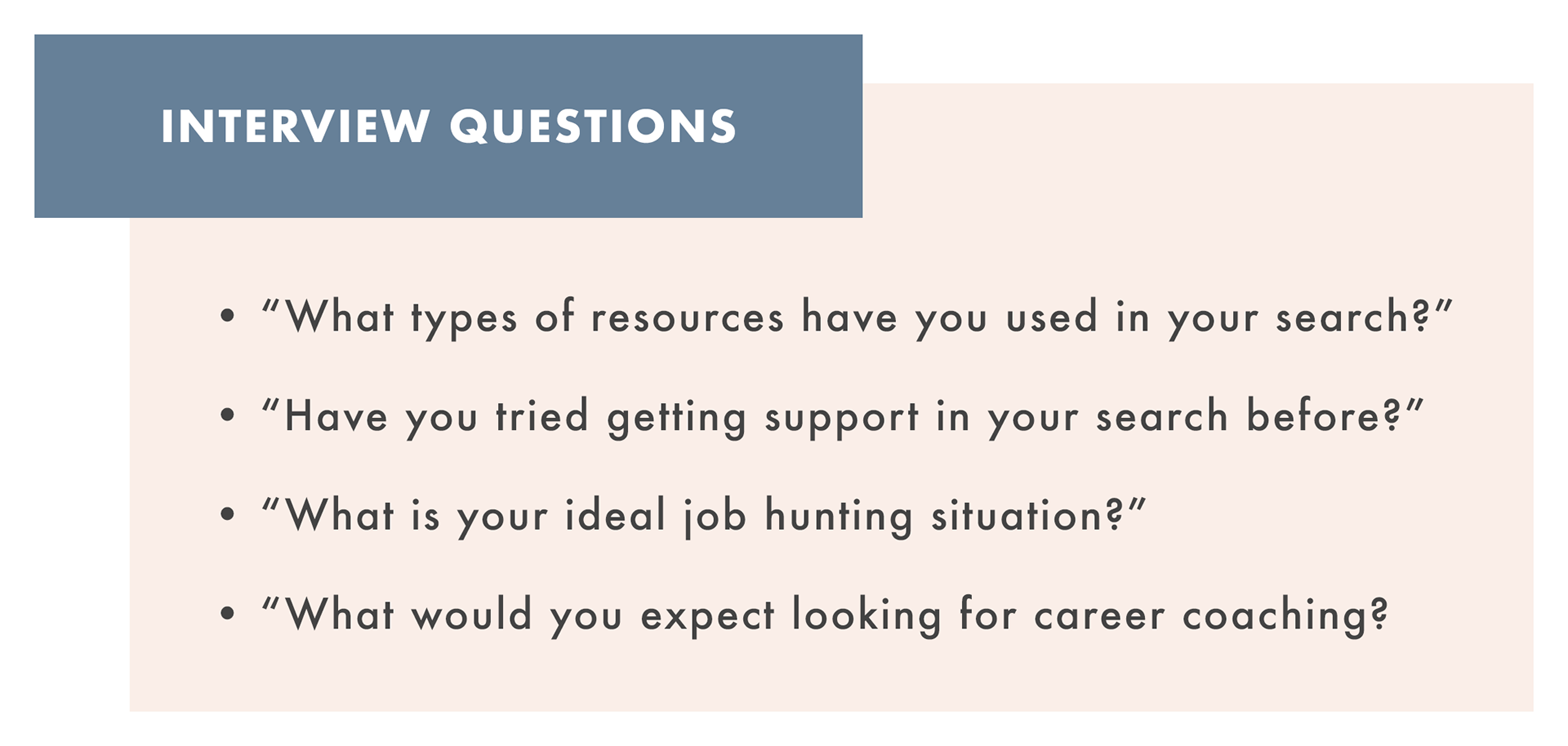
User interviews: Conversations with members of the target audience
Contextual inquiry: Observing volunteers interact with the product in a use-case scenario
Element analysis: Research into how specific elements of the site compare to competitors
Heuristic evaluation:
This is our project starting point, an objective analysis of the original product from our own perspective. Not being users limits the scope in many ways, but still leaves room for opportunity. The heuristic evaluation allows us as designers to get an initial feel for the site, and answer questions about its system. Such as: What are the design standards it uses and is it consistent? How flexible/efficient is it? Does the site leverage recognition of familiar elements over recall of its own system?
User interviews:
In the interest of gaining empathy and understanding with users, it's important to talk to them. Non-leading questions that allow people to reflect in an unbiased way provide some of the best insight into the bigger picture of user experience. It's natural for designers to have their own assumptions about a product and its users. User interviews are an essential part of breaking down our preconceived notions and personal biases. The data collected is organized by common themes called affinity maps in the next phase.
Contextual inquiry:
Observing and interviewing users in the context of interacting with the product deepens our understanding of their experience, and allows us as designers to have an opportunity to communicate directly with users as they experience the product in real time. We can ask questions like: "Why do you think you did that just now?" or "How does that make you feel?".
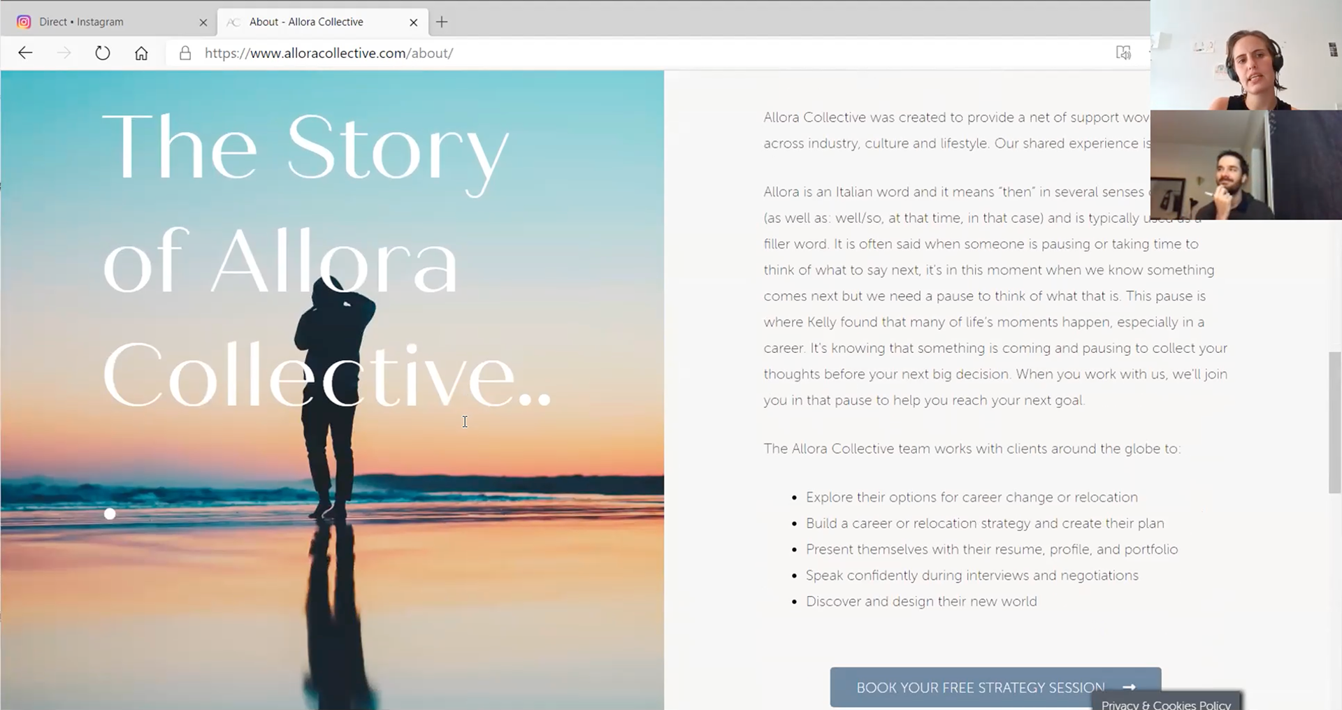
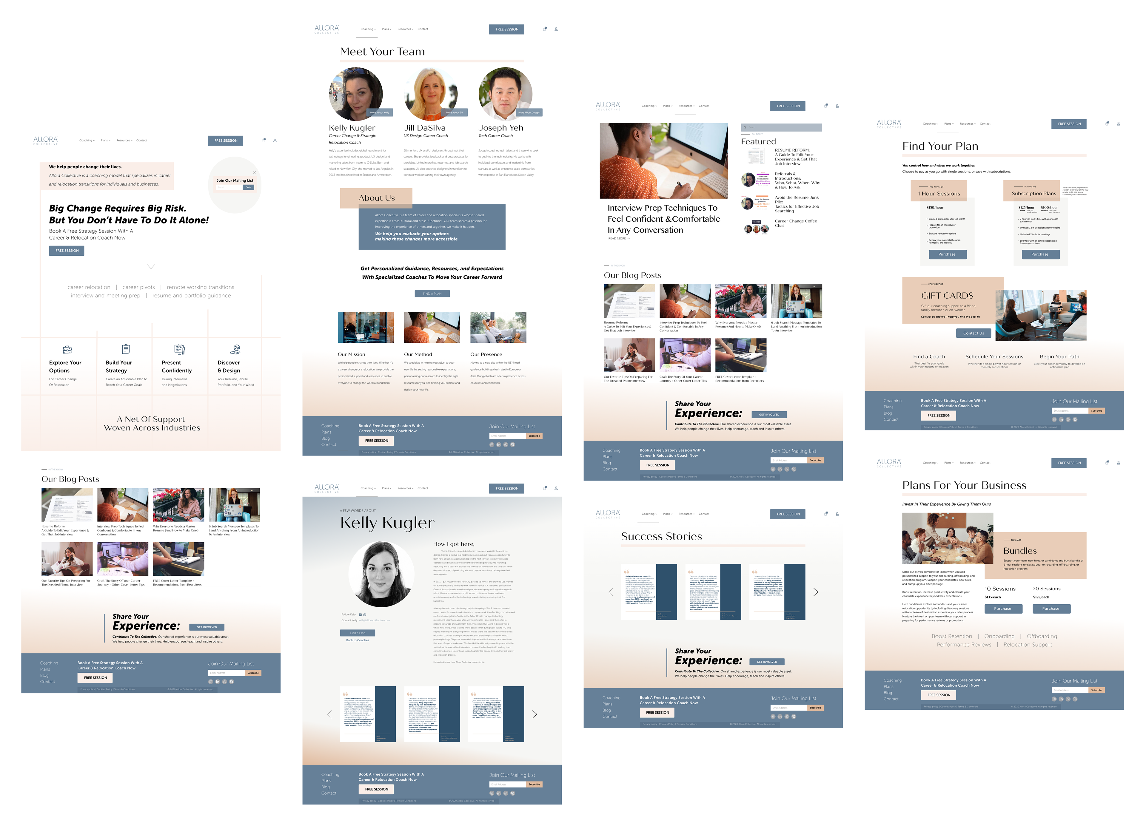
Element analysis:
Here is a short excerpt of some of the element analysis research into design patterns that exist across competitors in the career coaching industry. This step confirmed that there was nothing in the site far enough from existing standards to negatively impact our user experience.

Phase 2 of 4 - Define
Once we established some context in the discovery phase, we were ready to start honing in on areas of opportunity. The process of defining our design goals involved these key steps:
Affinity Mapping: Organizing quotes from user interviews into categories
User Personas: Fiction persons representing the interests of the target audience
Problem Statements: Summary of the main problem to be solved for the user
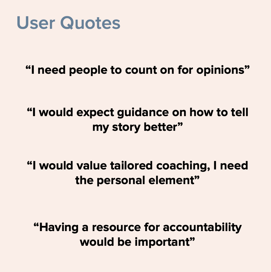
Affinity Mapping:
Looking for patterns in interview data we started to get a better understanding of Allora Collective's target user audience. By better understanding our audience, we gain a more personal empathy. It helps us as designers to better anticipate user's needs, goals, and challenges.
User Personas:
This is Carla, a young college graduate living in LA. She currently works in sales, but if you ask she'll tell you her real passion is technology. "If only I had some help breaking into the industry?" she wonders. After struggling with vague online resources she's wondering if a more personalized and direct approach would work better. After a bit of searching, she finds her way to Allora Collective's website. She knows there are benefits to coaching, but it's also more costly than doing things alone. Before making a decision it will be important to understand the real value of the different plans and if any are right for her.

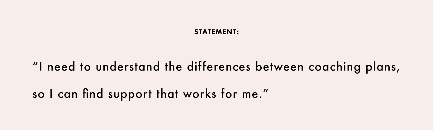
Problem Statements:
Considering Carla's goal, to find a vetted coach, as well as her challenge, of learning the value of different plans; a statement is crafted representing her interests.
Phase 3 of 4 - Develop
At this point, we've got the right shoes on. We know what problem we want to solve. We only need to decide how to do it. The development phase primarily consists of the following:
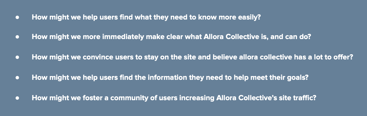
"How might we" statements: Setting our specific goals to help users overcome challenges
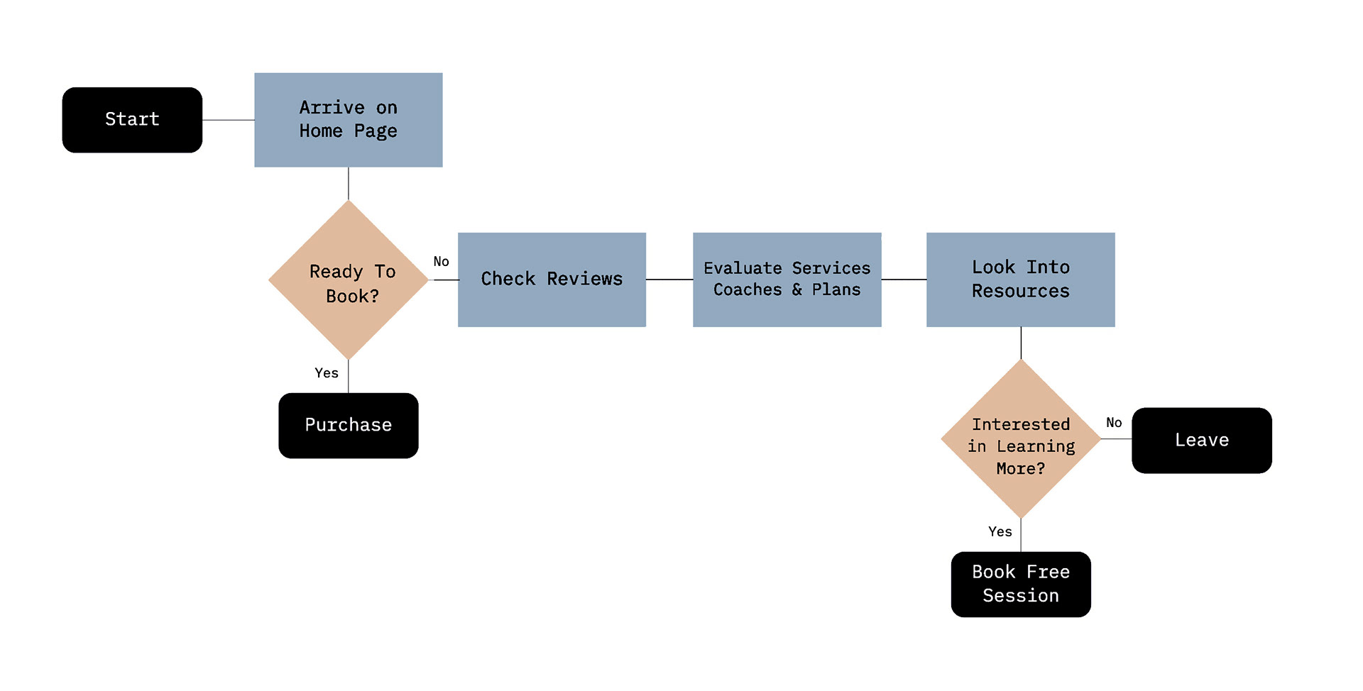
User flow: Diagram of the journey users make navigating the separate pages of the site
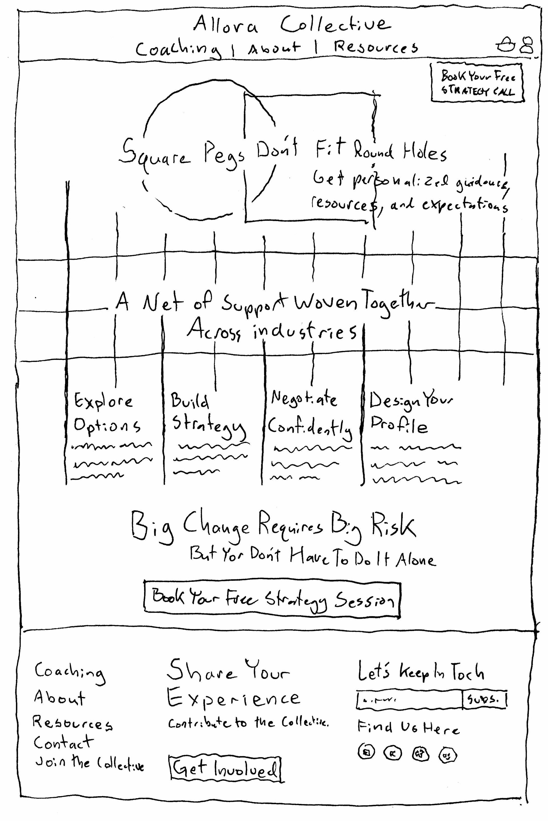
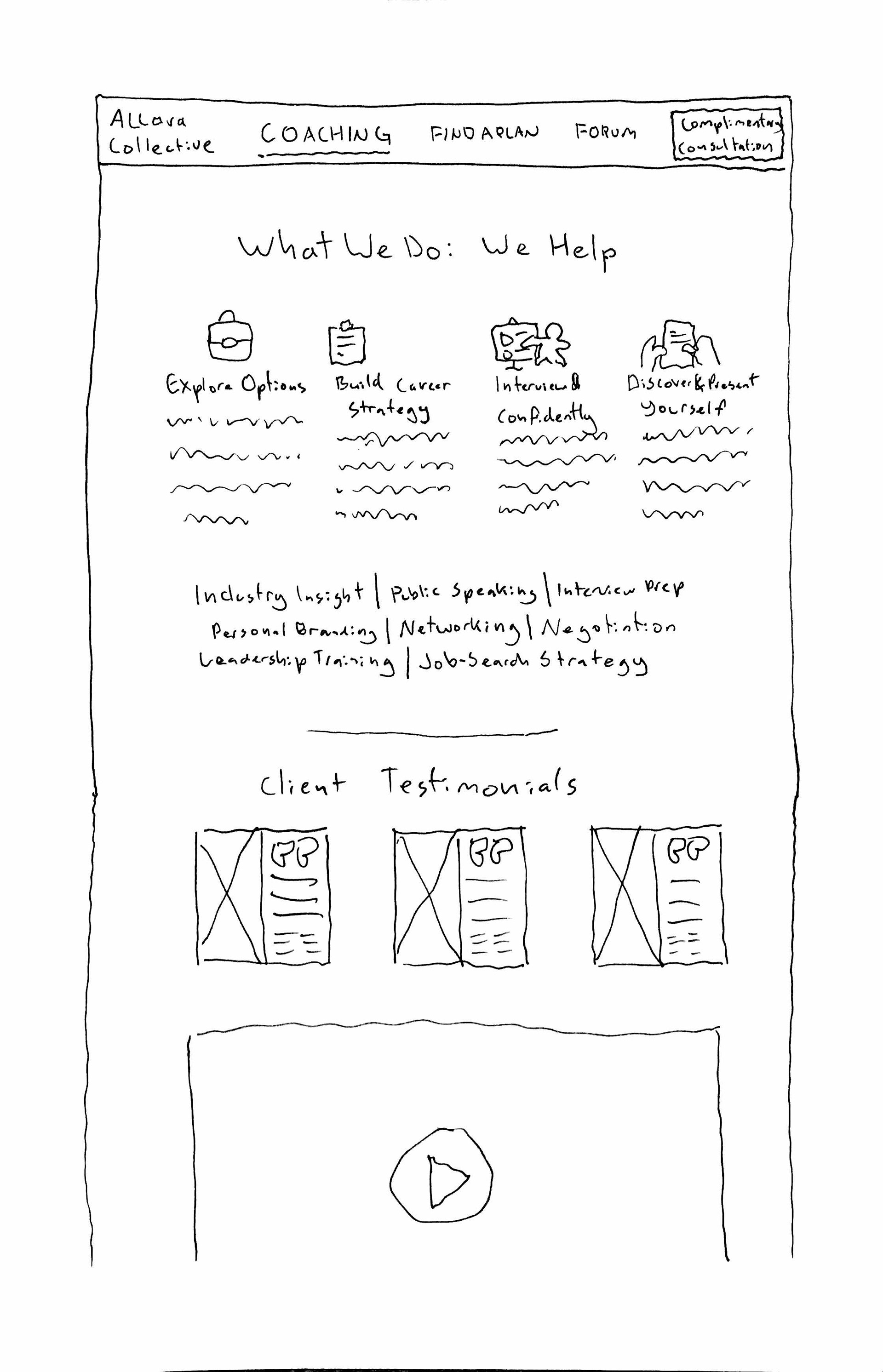
Sketching: Quick, rough drawings of design concepts
Wireframes: Both low and high-fidelity representations of the site's design and basic functionality
Usability testing & iteration: Evaluating designs by testing them as an interactive prototype with volunteer users
"How might we" statements:
Thinking of our user persona's challenges, we crafted statements aimed at further focusing on our goals. Formating our intentions in this way helps early-stage creative problem-solving stay centered around the main issues without distraction.
User flow:
Before rushing into design solutions, it's essential to map out the exact steps necessary for users to complete. This plan considered two possible audiences. The first are people who already planned to book before arriving. Many users are looking for quick functionality and don't need to be led through a journey to sign up. The second group was still considering the Allora Collective as an option. Their path included checking personal reviews, evaluating services/coaches/plans, and considering extra resources.
Sketching:
Guided by the "How might we" statements, we start to imagine design solutions to our persona's problem statement - "I need to understand the differences between coaching plans, so I can find support that works for me". Compared to our over-arching goal of boosting user interaction via a site redesign, these statements allow for a much more direct approach to improving user experience. I personally prefer sketching by hand at this stage, as it helps me quickly move between ideas.
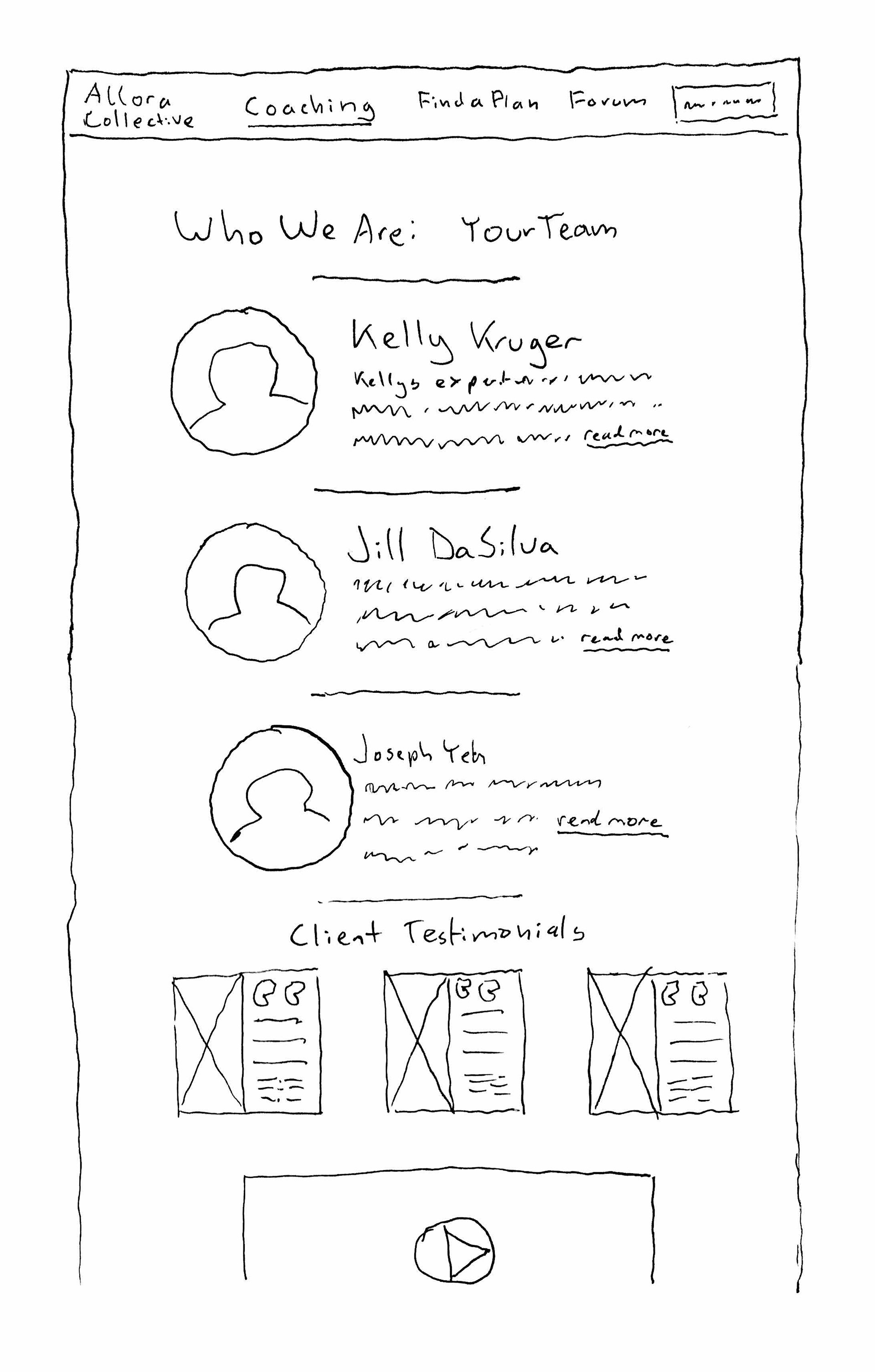
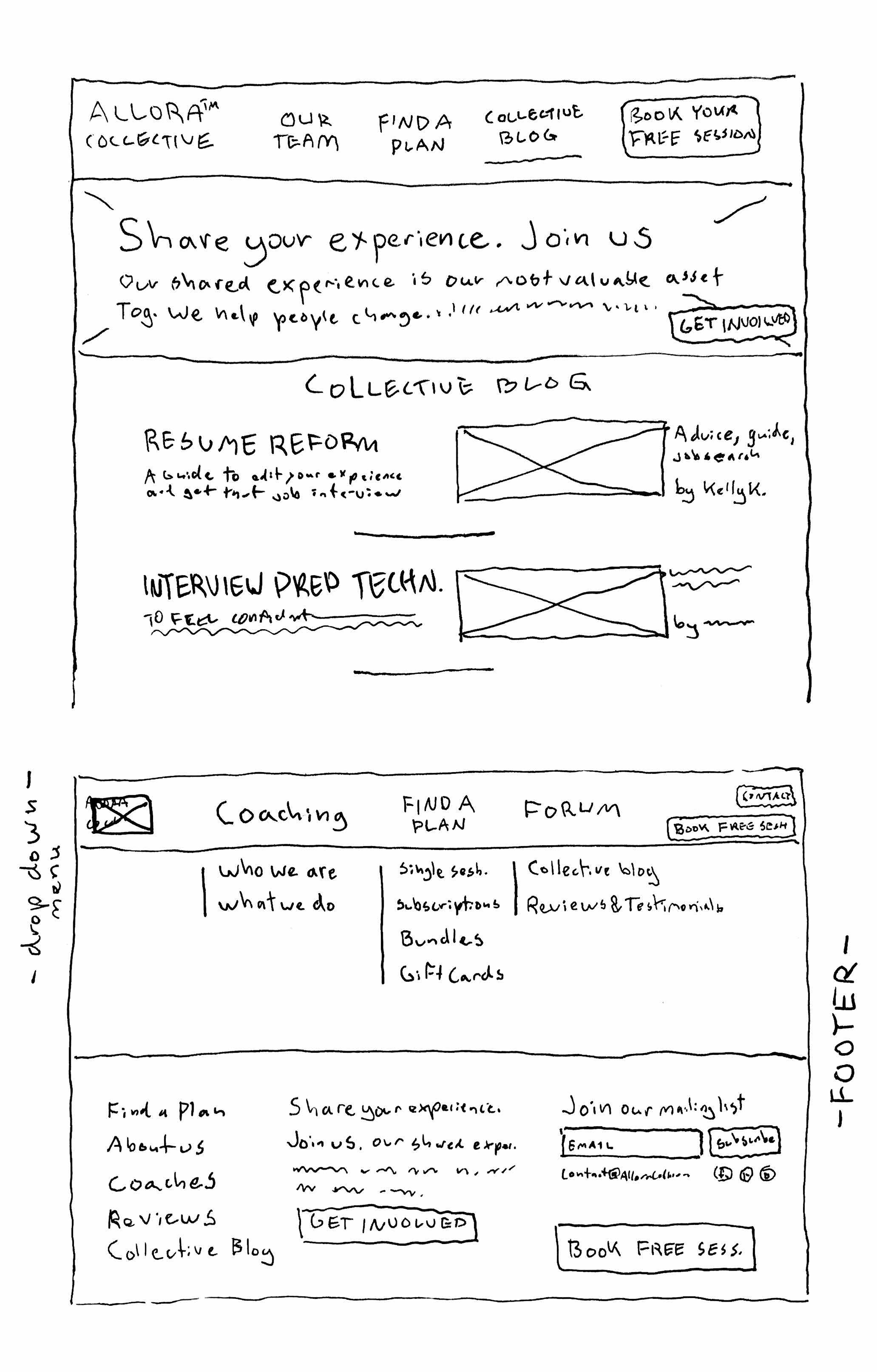
Wireframes:
Working towards a fully interactive prototype for user testing, we quickly move between the stages of rough sketches, digital greyscale representations, and eventually high-fidelity full-color wireframes of the site.

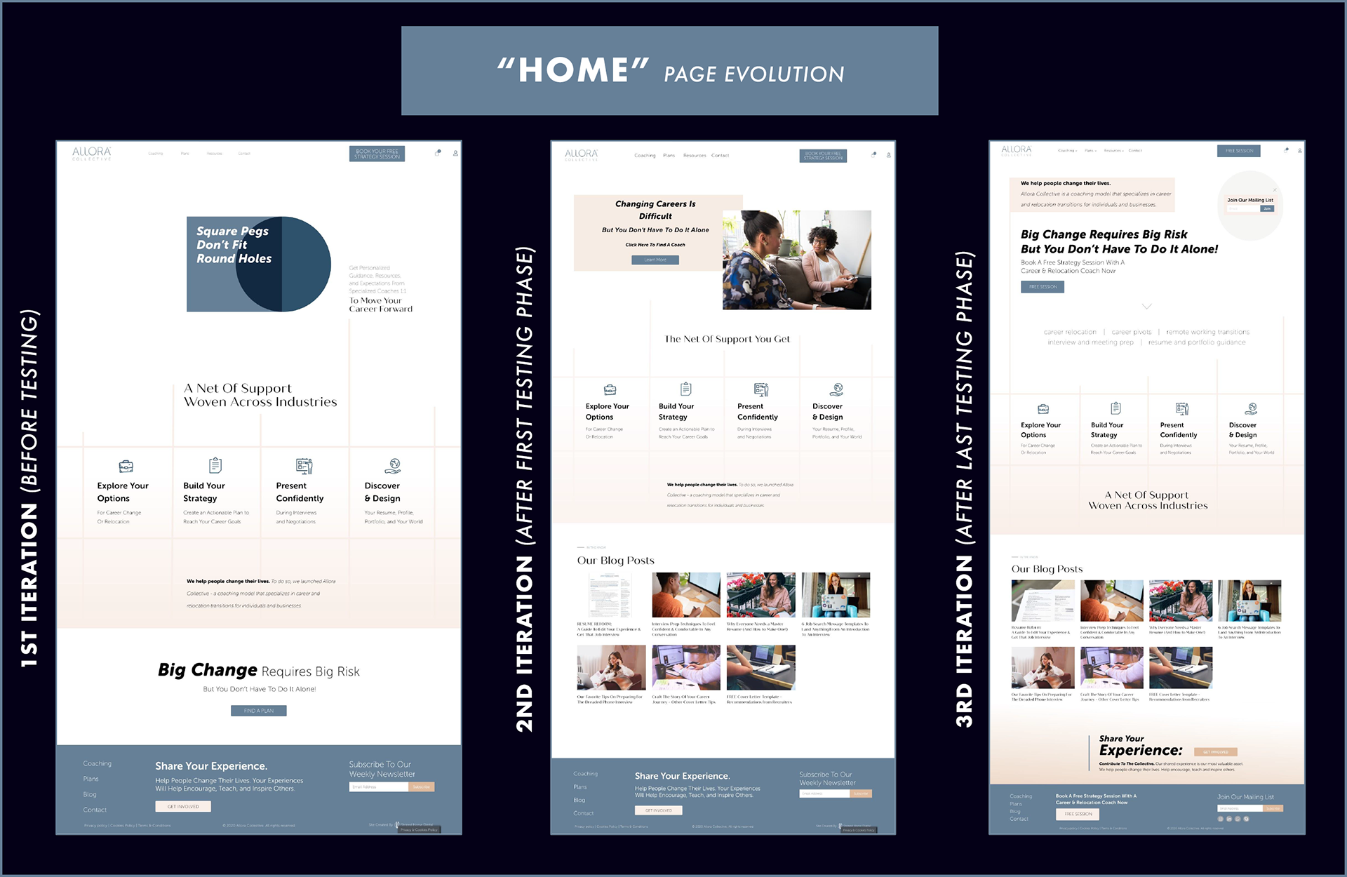
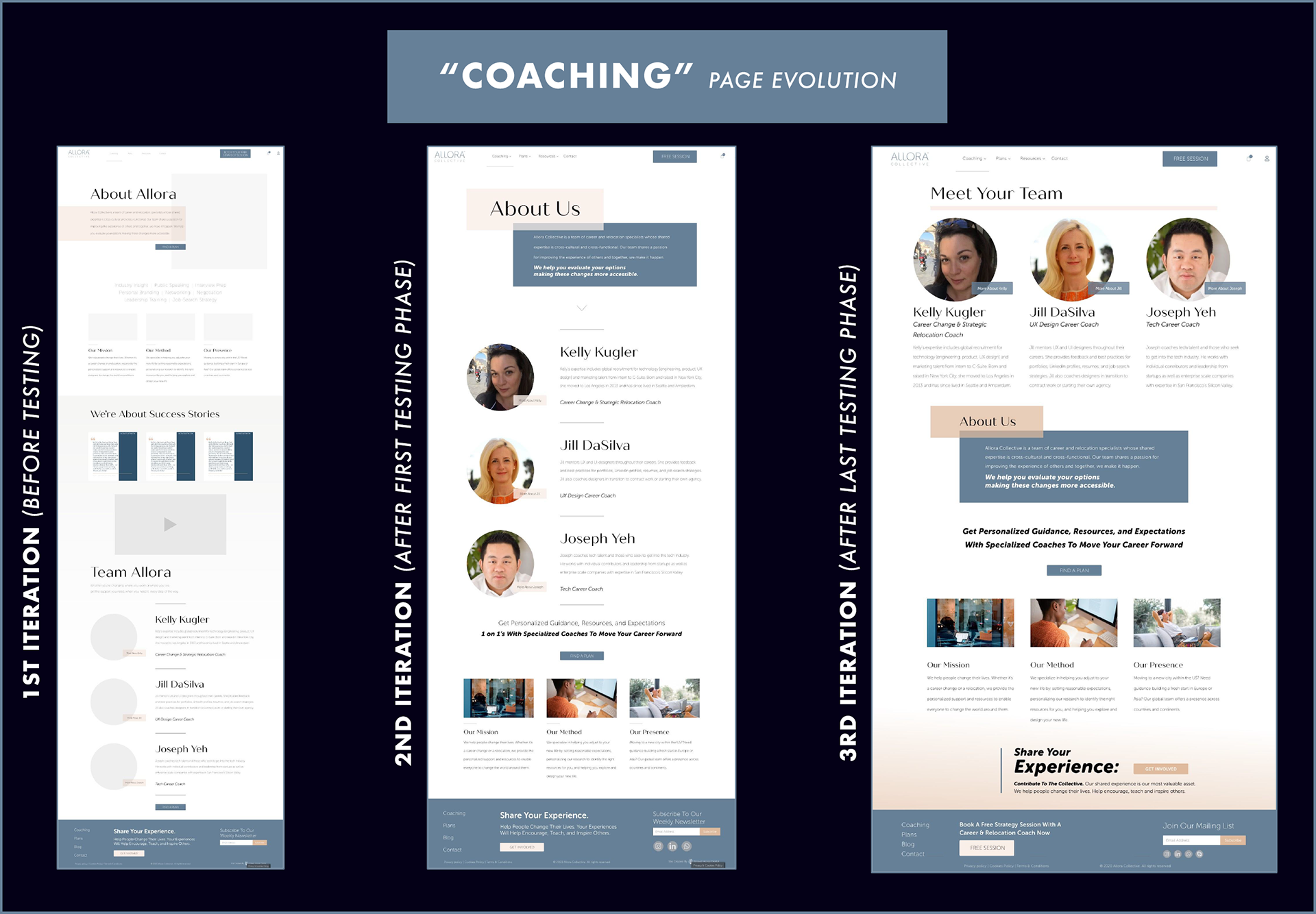
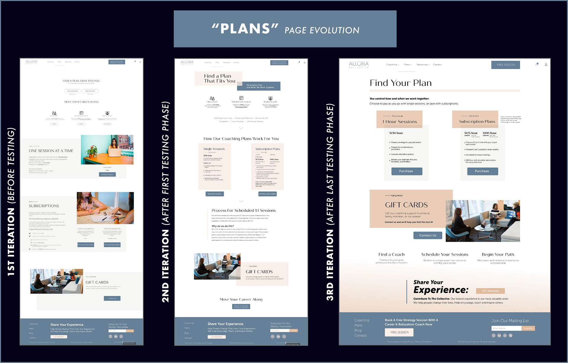
Usability testing & design iteration:
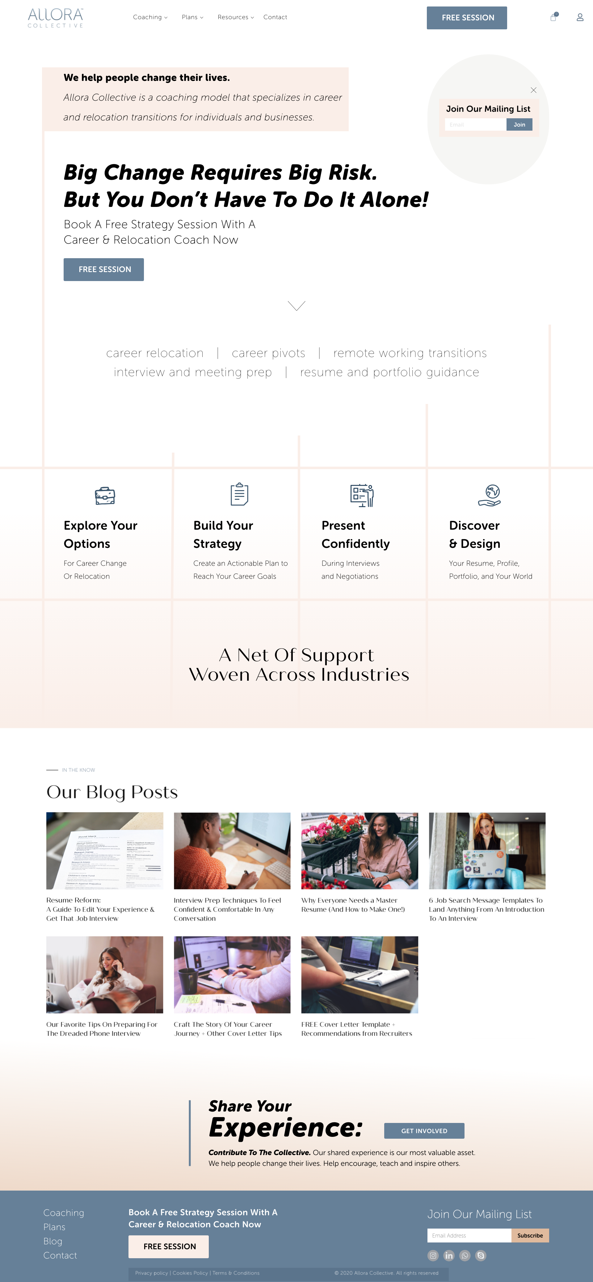
This project included two stages of both quantitative and qualitative usability testing. The quantitative testing utilized a system usability scale, or numeric survey measuring easiness of the site's use. The qualitative testing involved a moderated user task, where users were observed interacting with the site. The results of these tests led to many valuable changes in the designs such as the prioritization of certain content. It was also discovered that users prefer to navigate without the main menu navigation when possible, leading to more emphasis on the placement of navigational buttons mid-page.
Phase 4 of 4: Deliver
Finishing projects like this is always a bittersweet moment. A piece of me wishes the cycle of testing and design never ended, and the work just continued to evolve infinitely. But all stories have an end, and this was it for the re-design of Allora Collective. Including the culmination of our research reports from earlier phases, the delivery of our redesign included these materials:
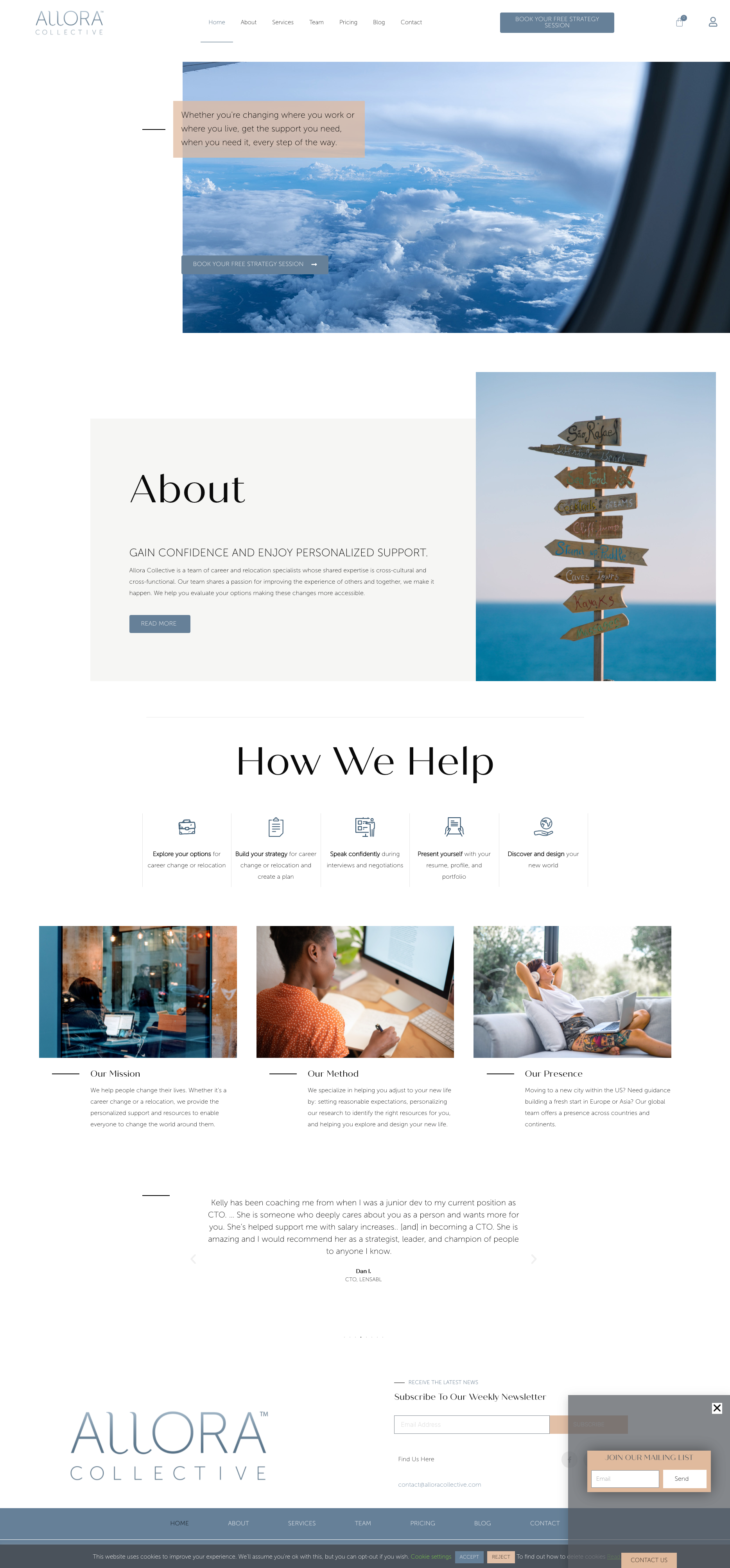
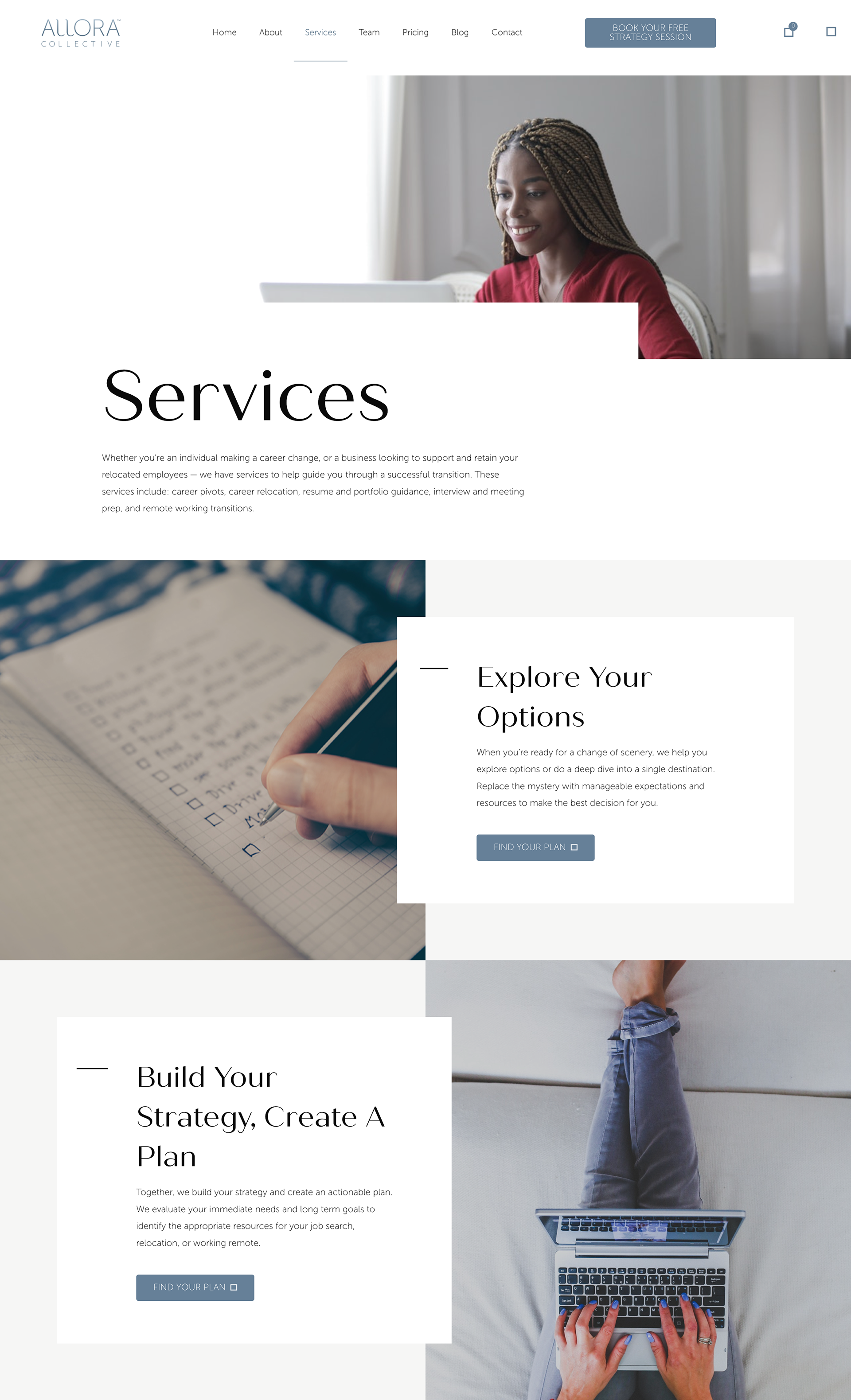
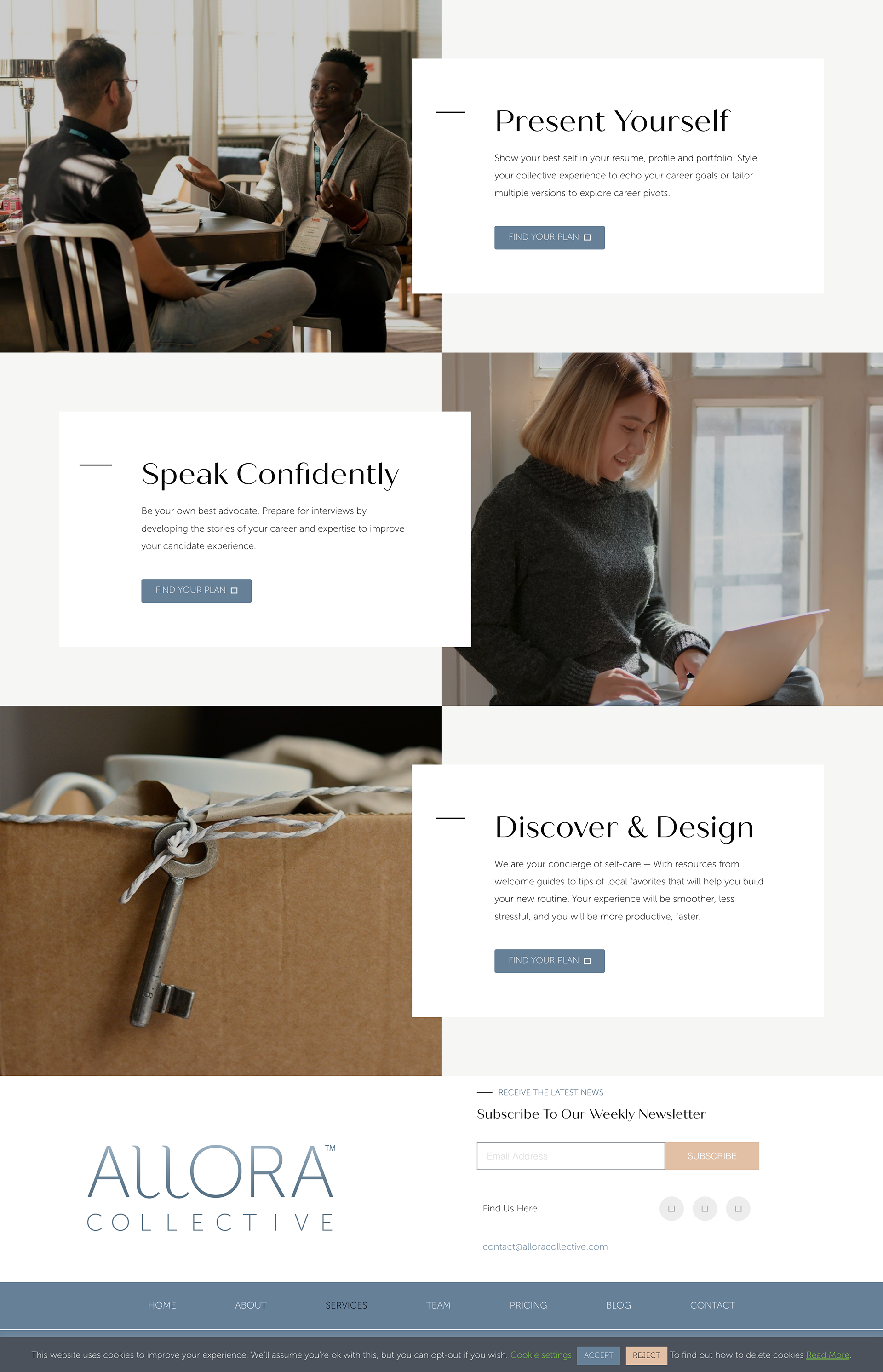
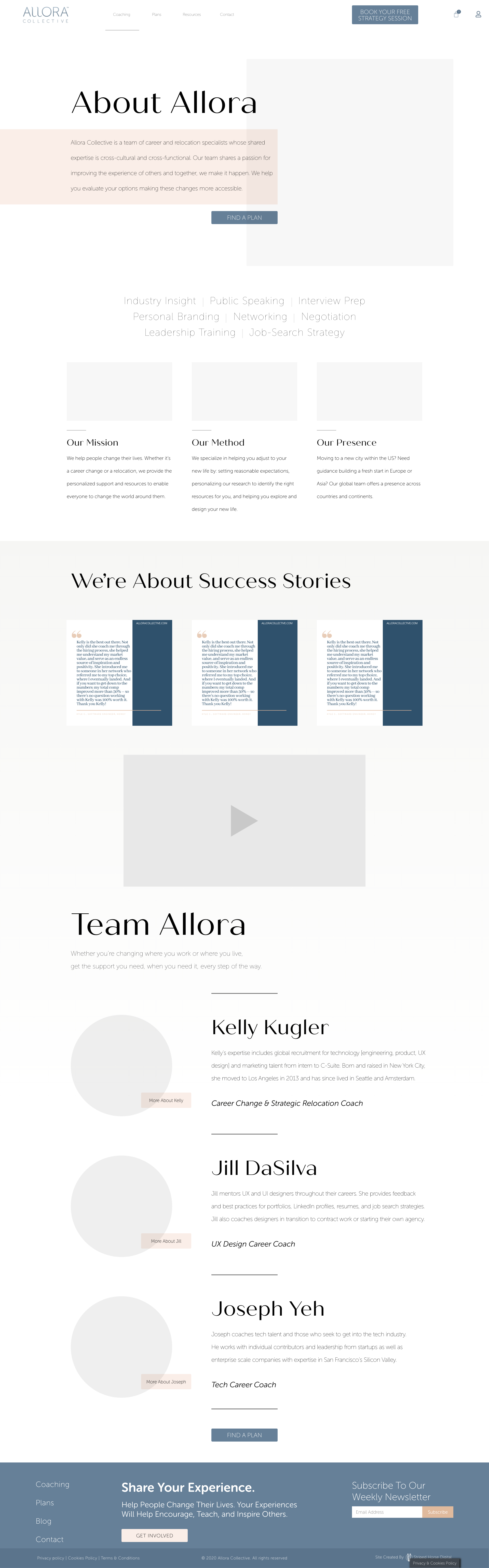
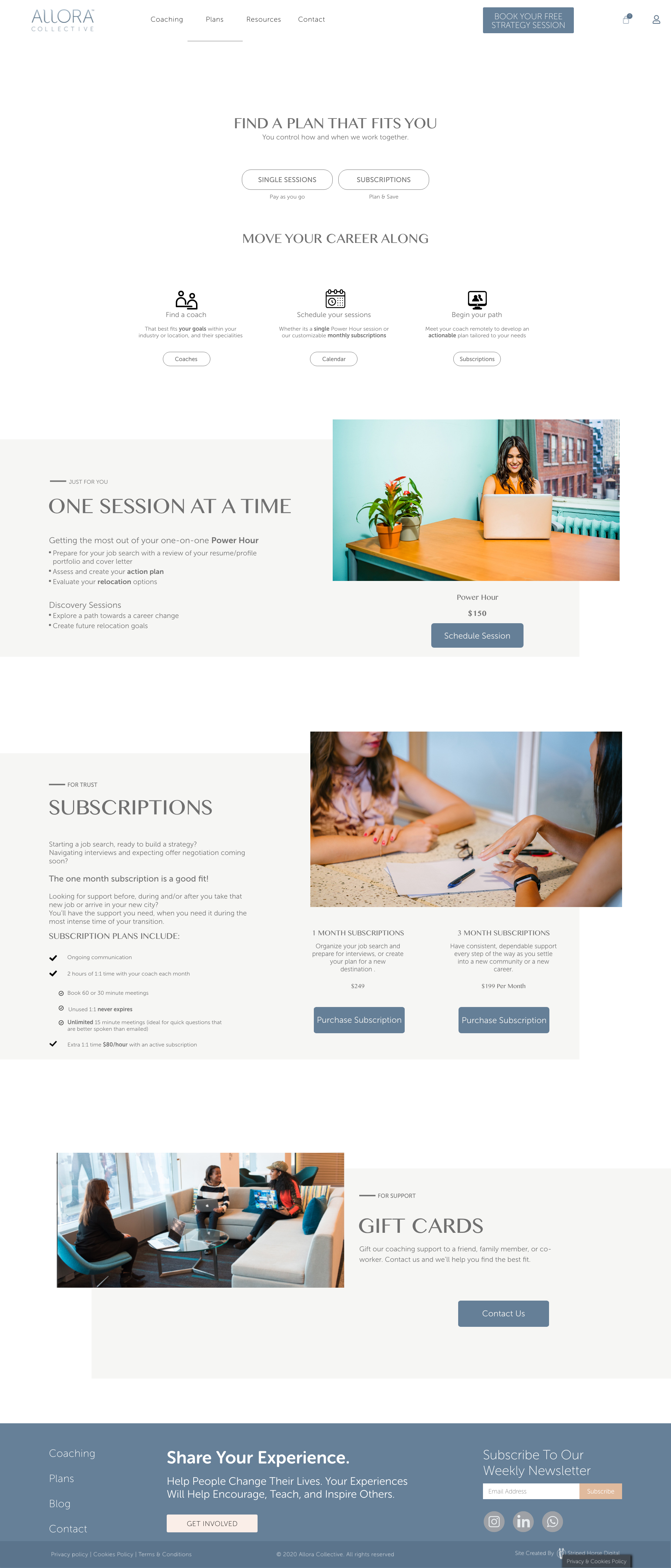
Interactive prototype: Final designs demonstrated with functional menu navigation and CTA's
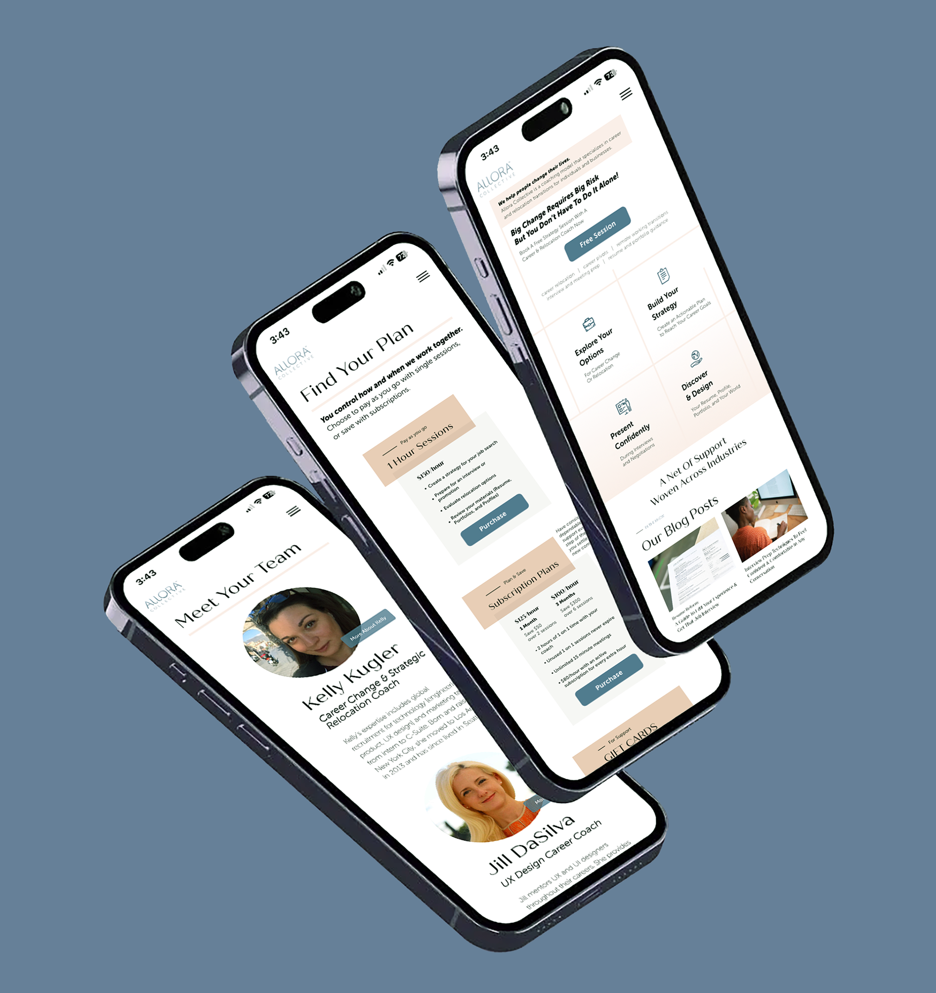
Mockups: Depictions of how the application will look in a real-life device
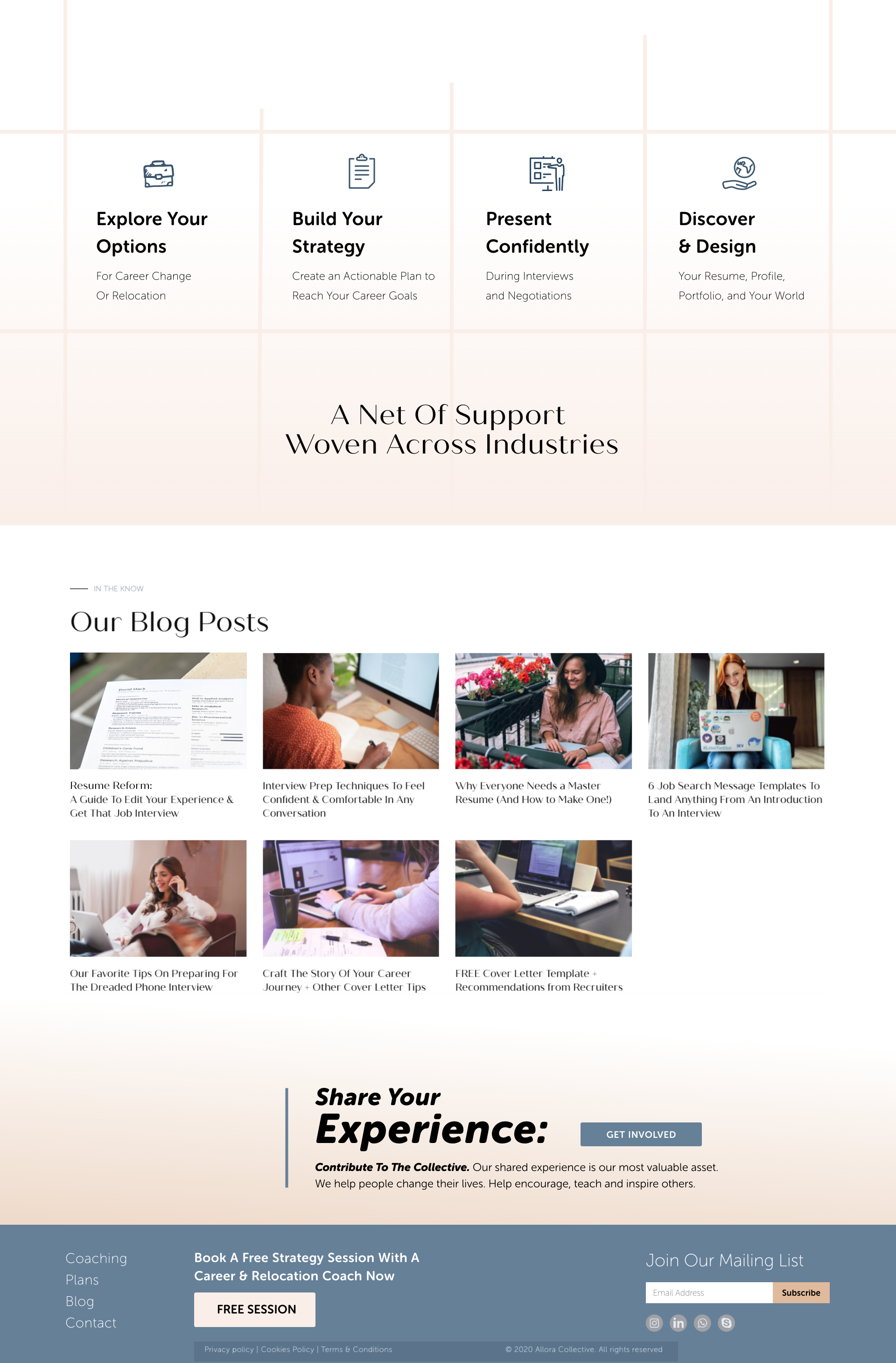
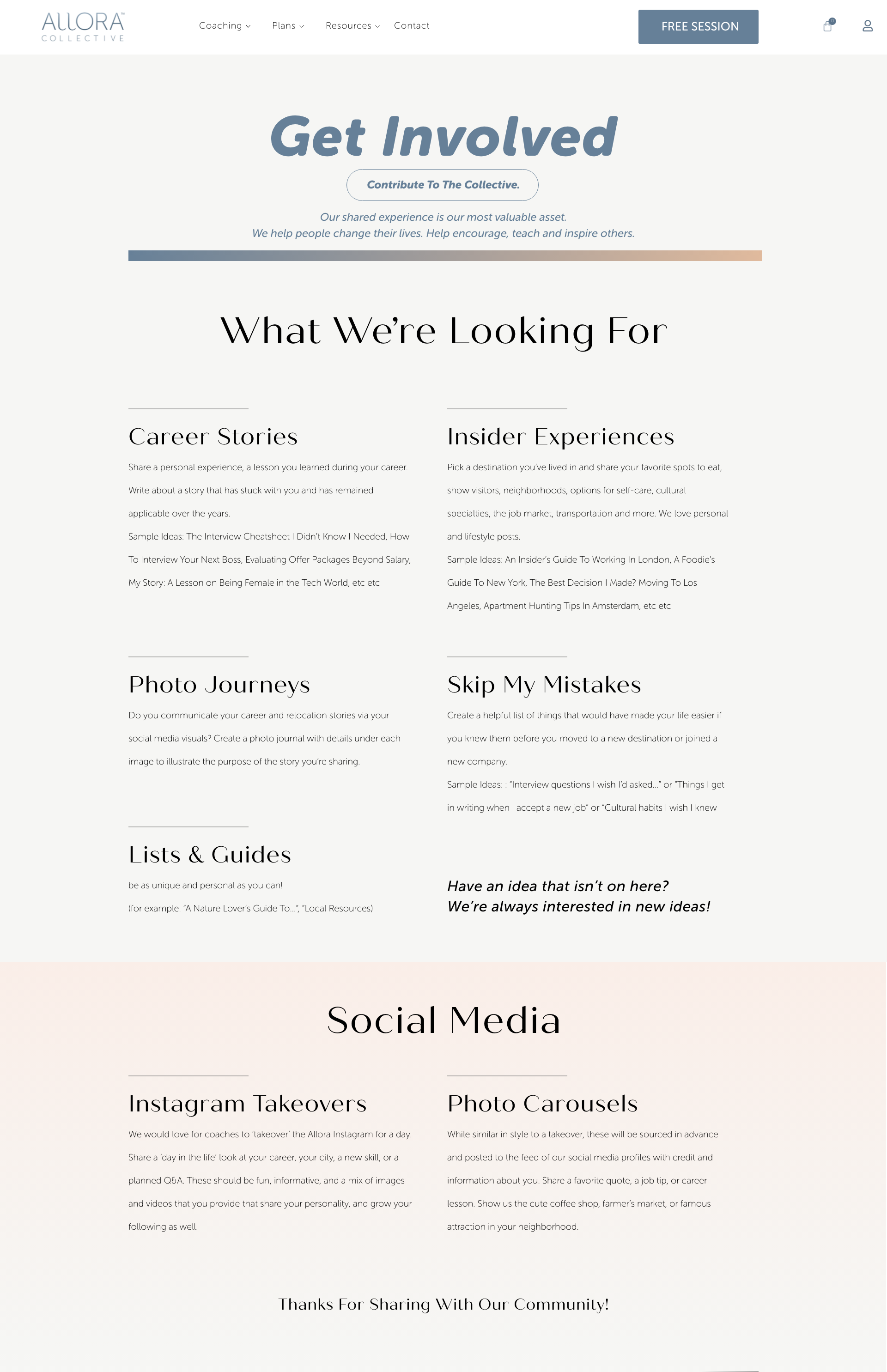
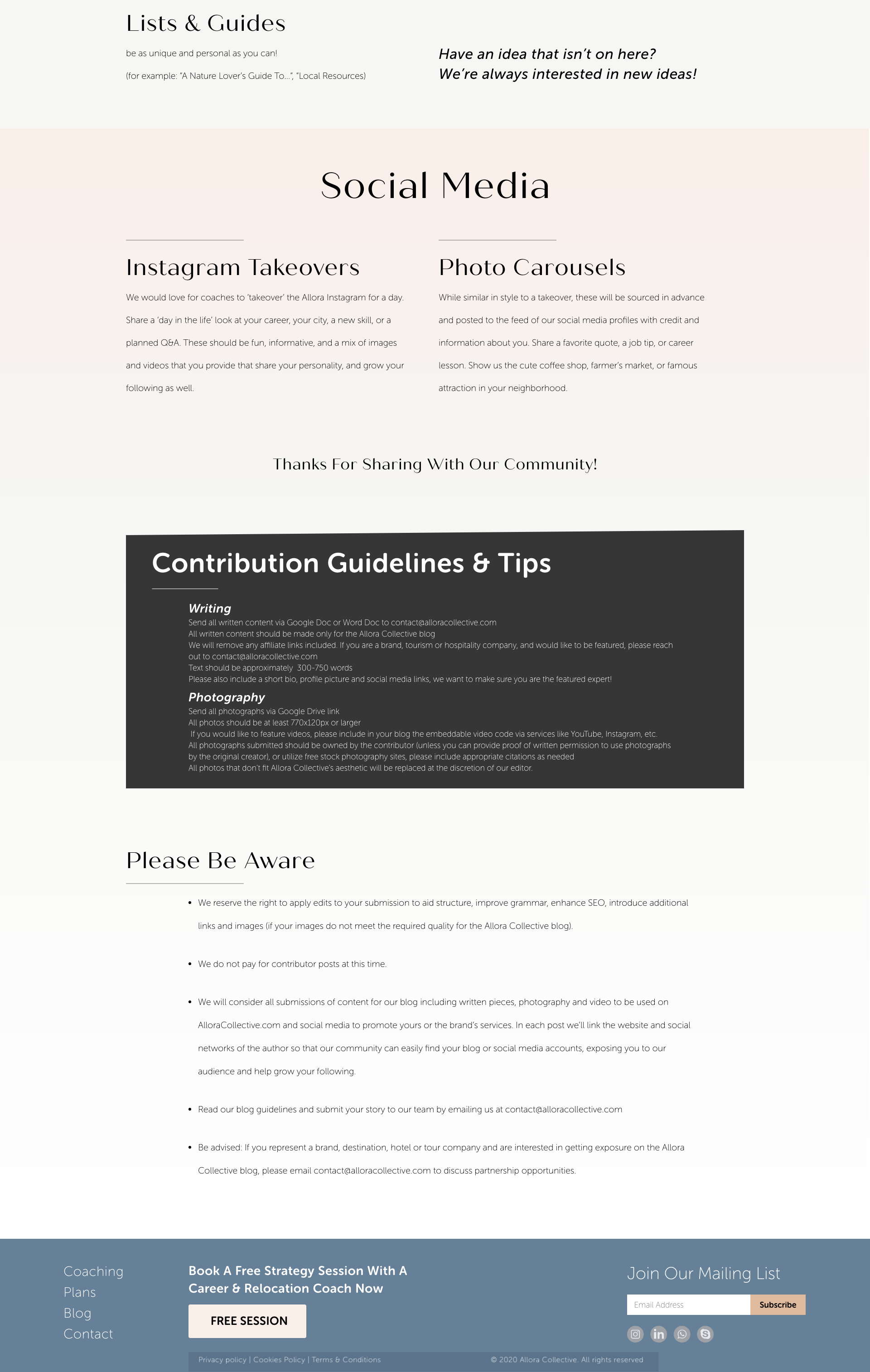
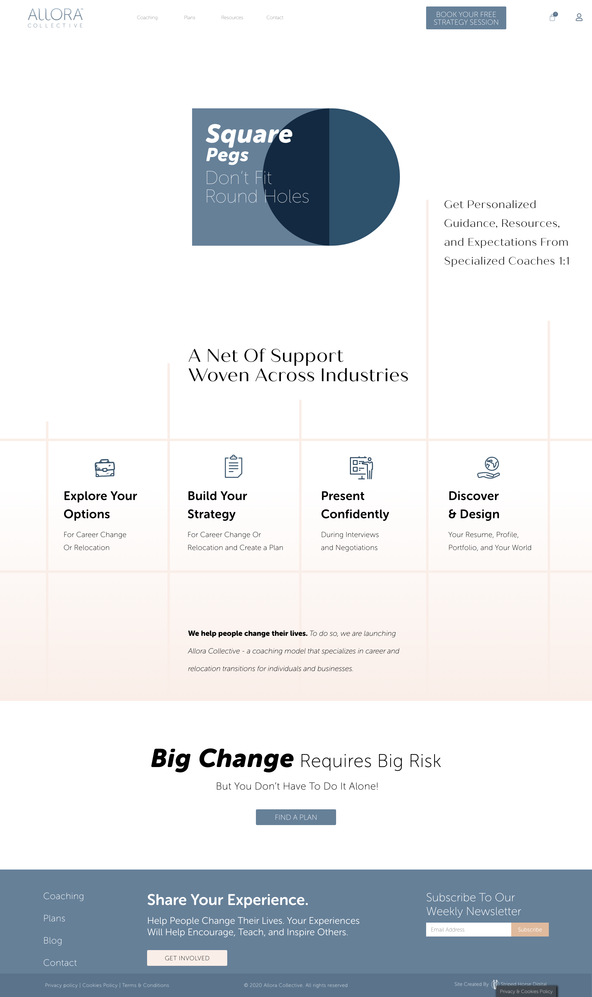
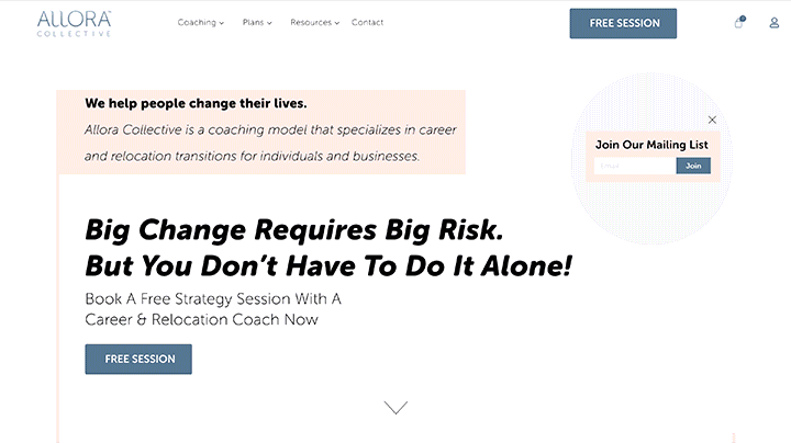
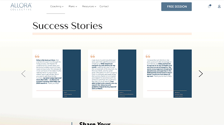
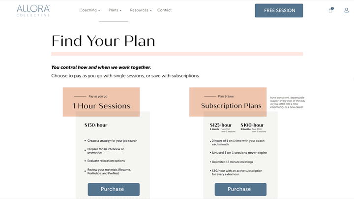
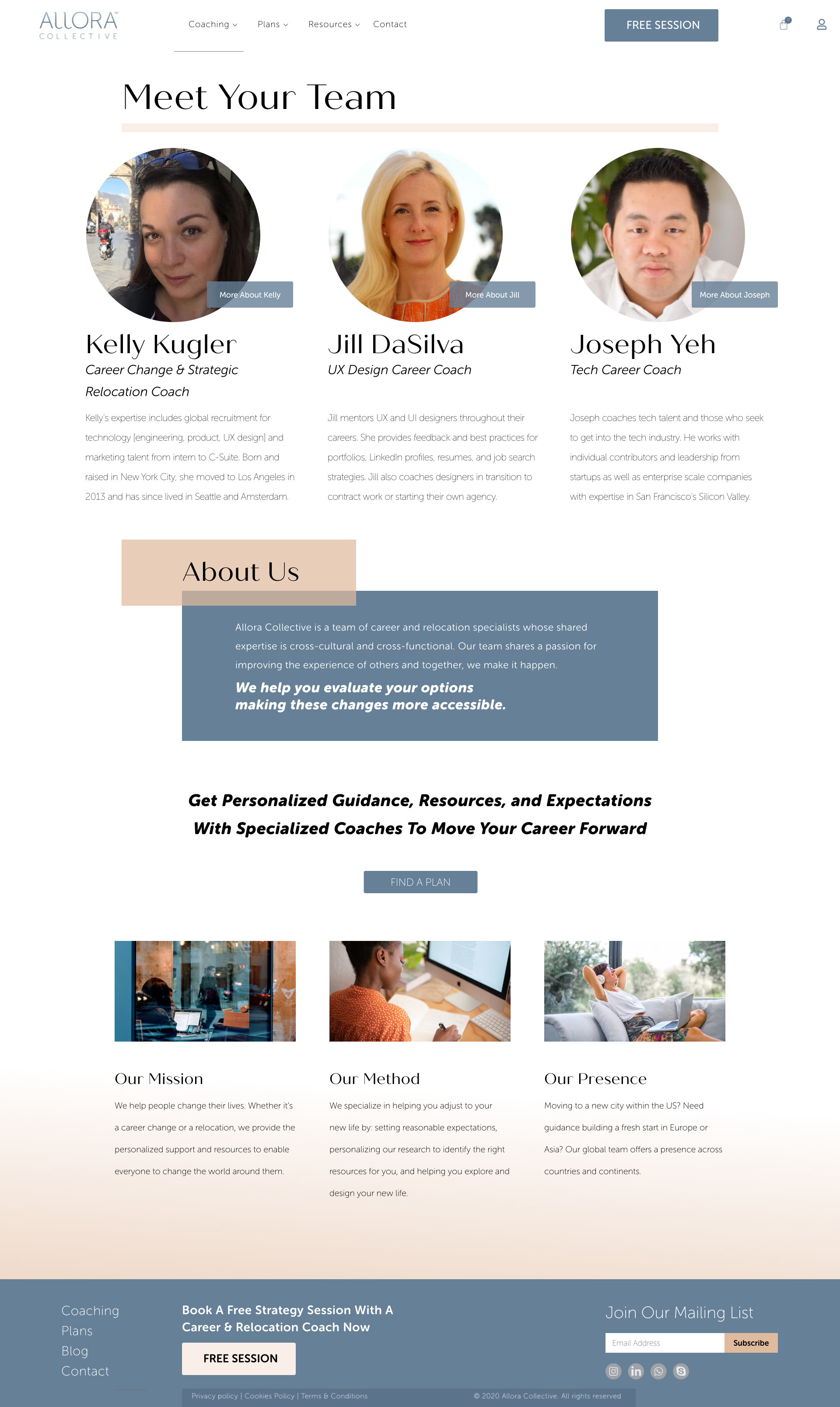
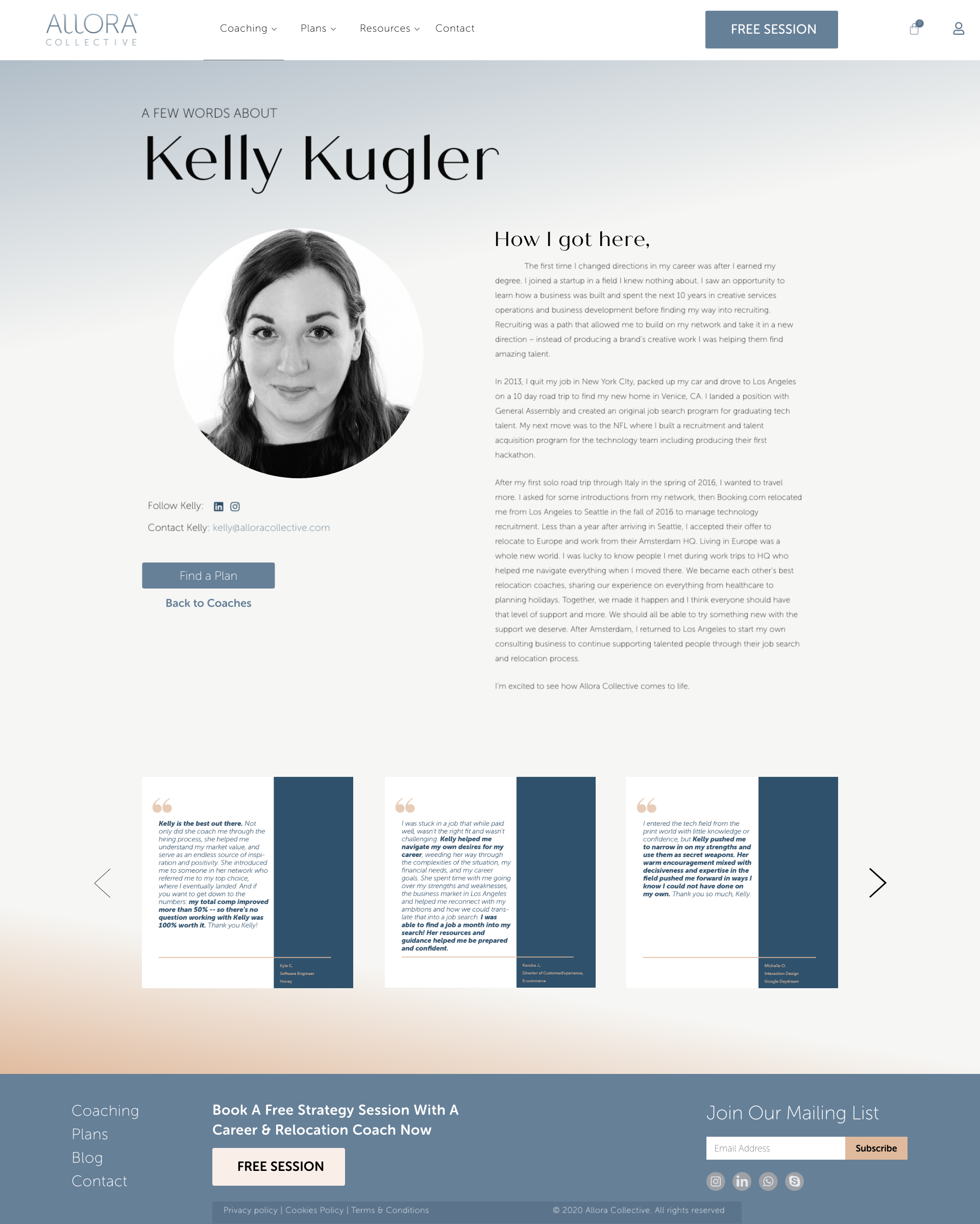
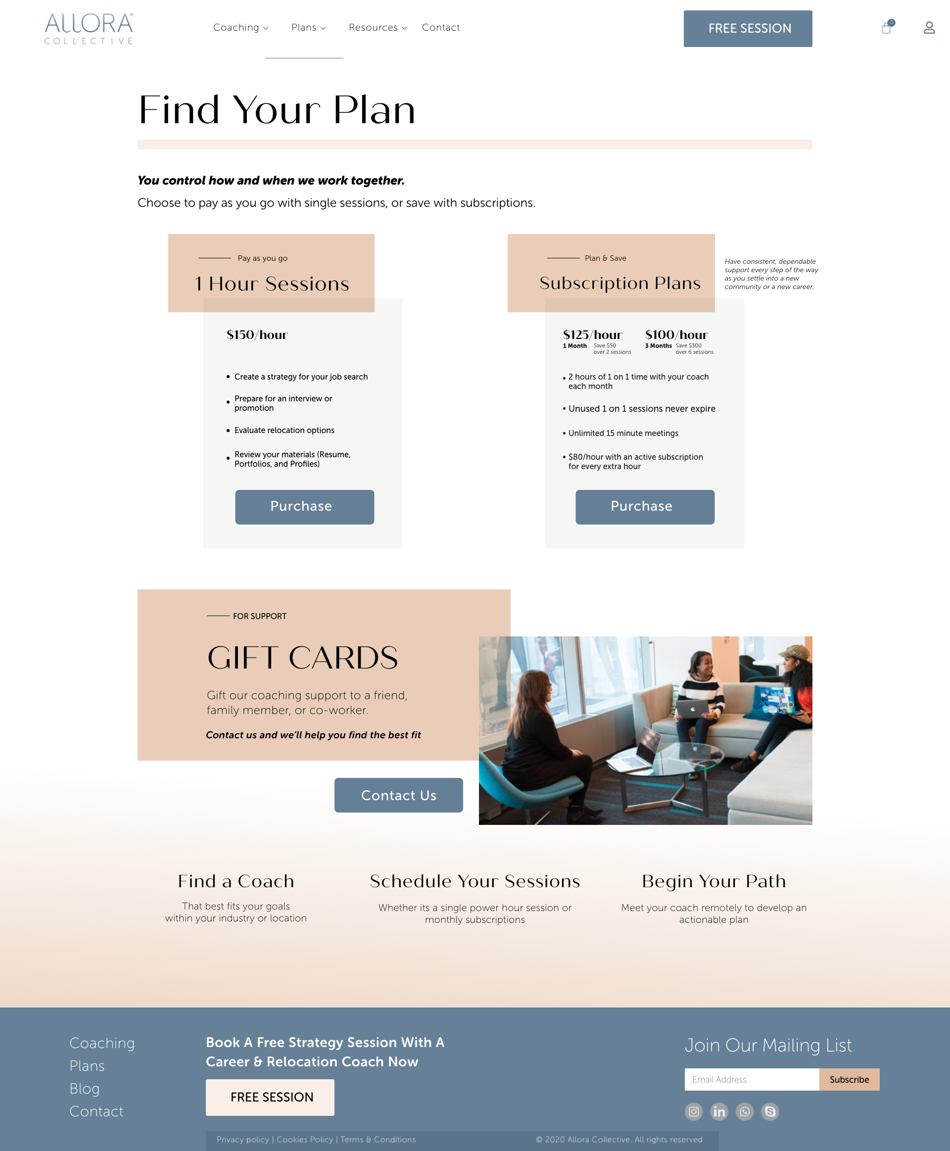
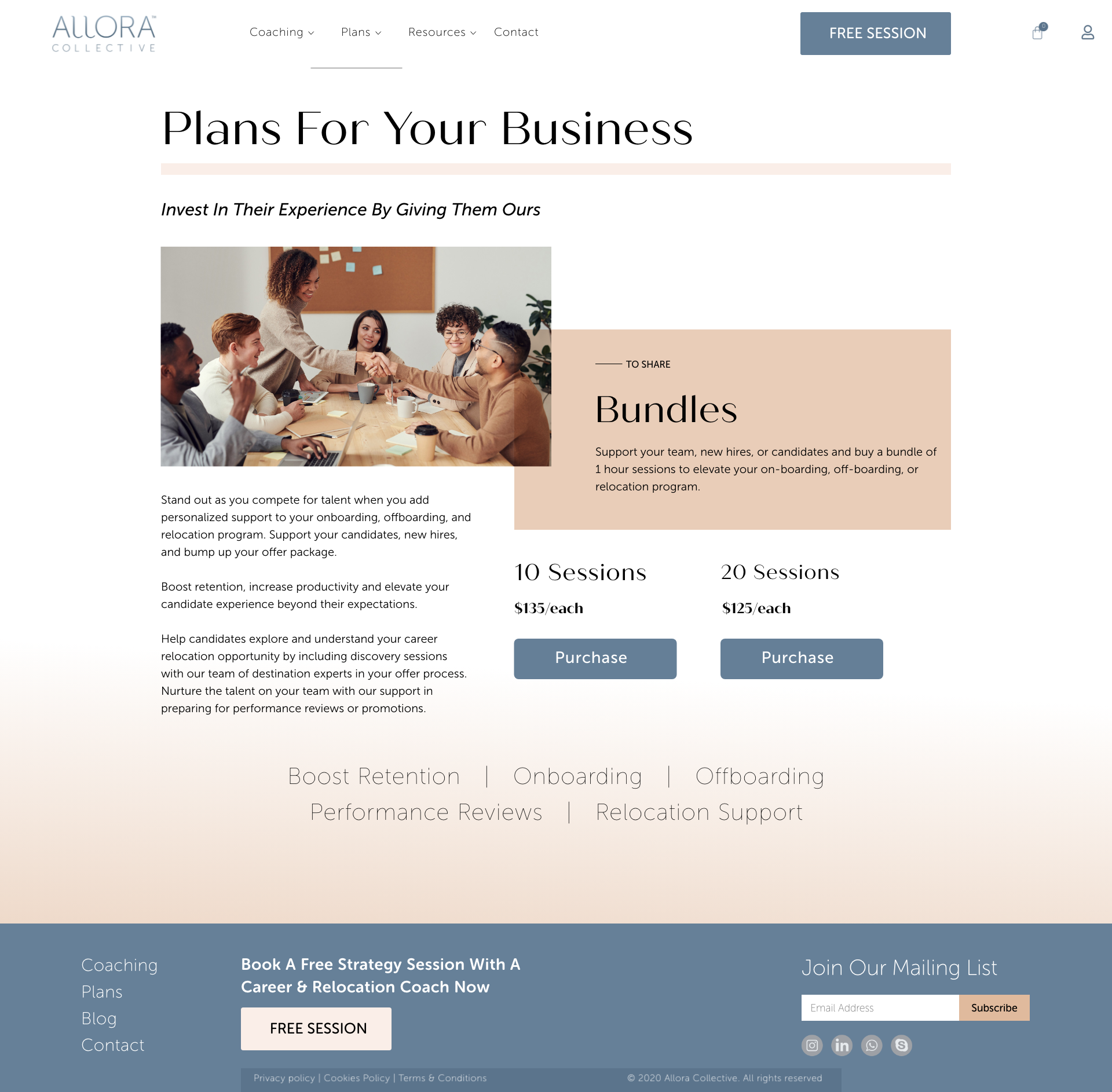
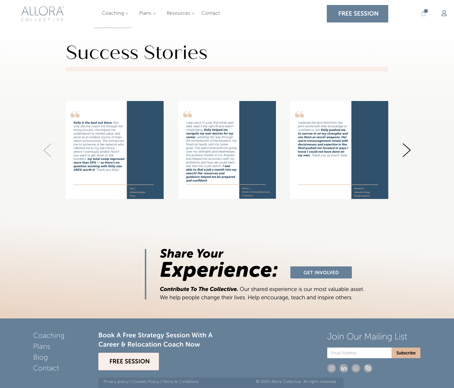
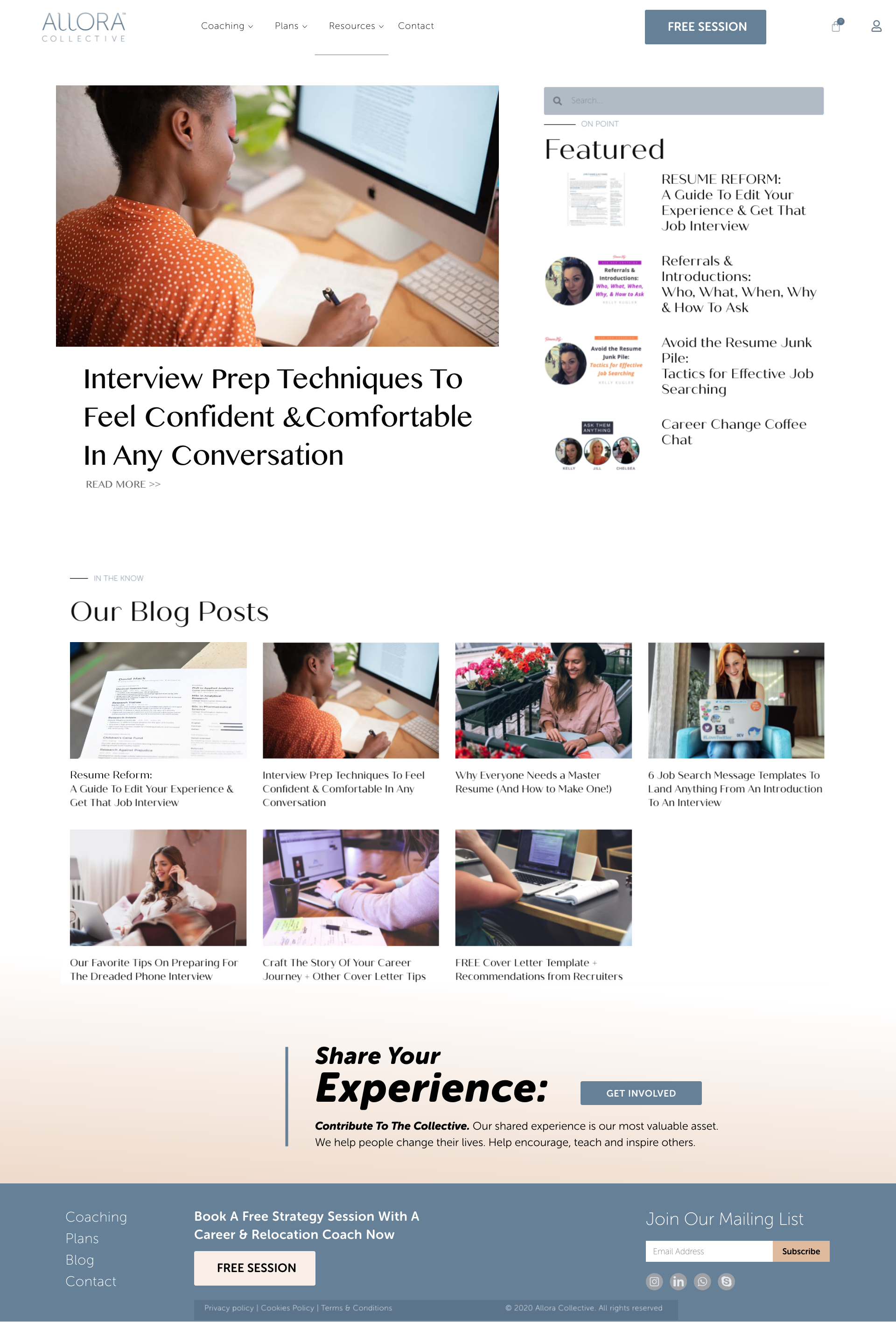
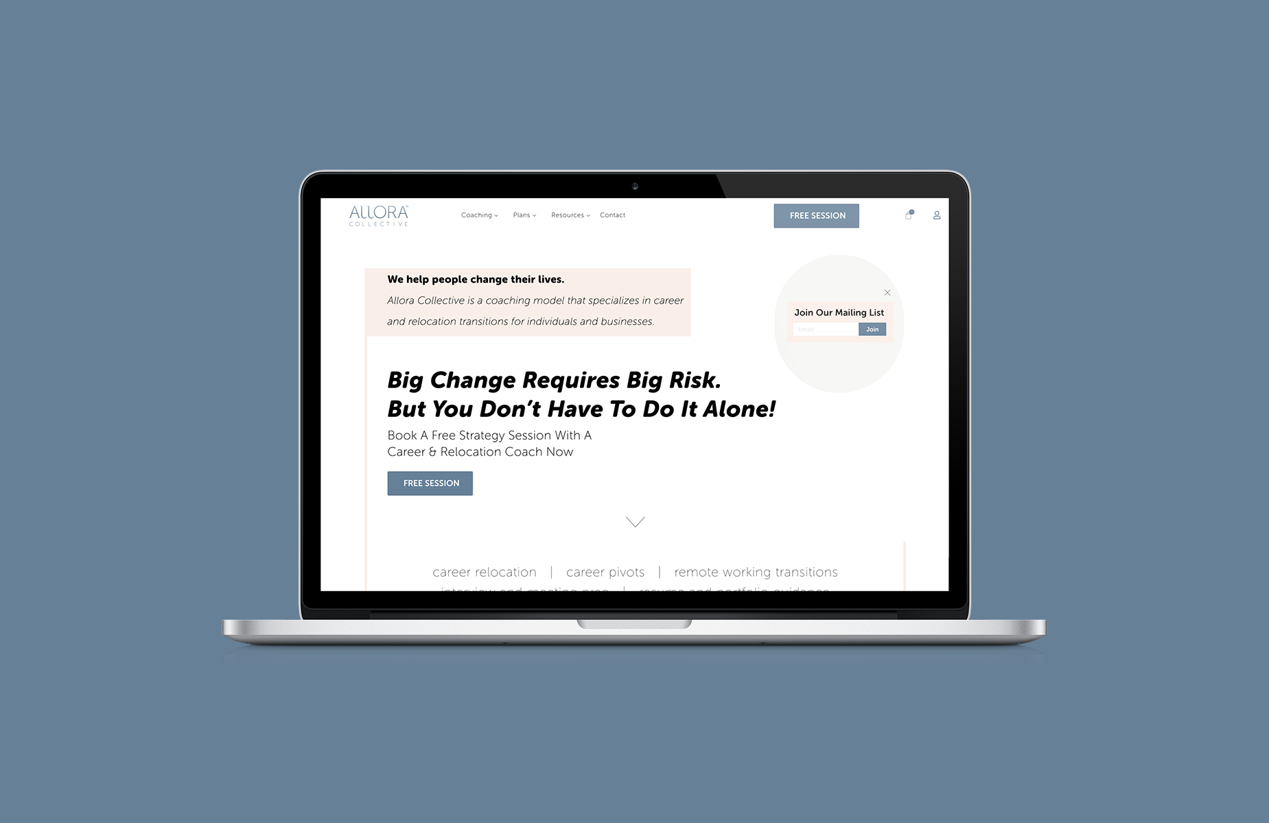
When creating prototypes I often enjoy adding the extra amount of functionality that makes it look and feel like a real coded product. There's always the chance a user will attempt to wander off the main path, and it generally allows for more flexible and complex testing. Demonstrated here are the landing, testimonial, about, and plan purchasing pages.
Looking forward
In the spirit of increasing site interaction, we also came up with some additional ideas for providing online resources, as well as a community forum. The forum's goal was to encourage global contributors with an opportunity to get involved. Above the footer on the home, blog, and testimonial pages is a prompt to "share your experience". The section leads to more information regarding contributing content and other ways to get involved.