CAPITAL ONE FLEX PAY
Project Type: Product Design
Background:
Flex Pay is a buy-now-pay-later product available within the Capital One Shopping browser extension. Its look and feel were created to be aligned with the international corporate brand while still achieving its own identity. As a fresh new product for Capital One, Flex Pay was an exciting opportunity to make something fun and original as an augmentation of a larger established design system.
Goal:
Create a website for users to learn about Flex Pay, as well as access it via downloading the Capital One Shopping
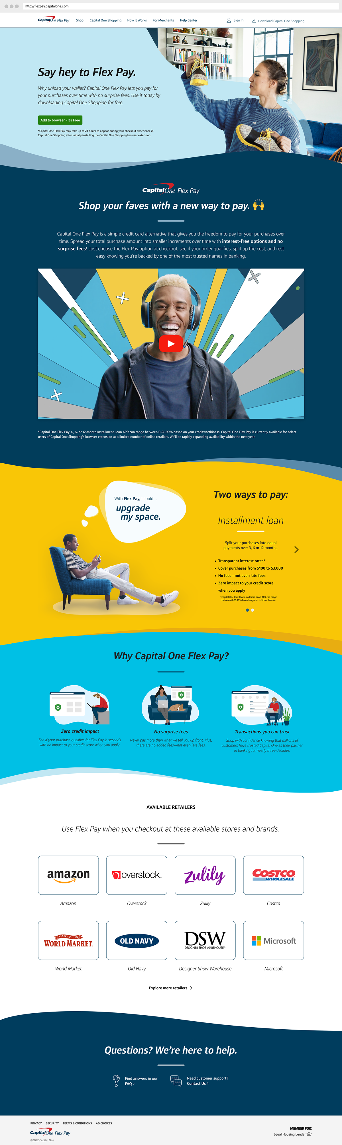

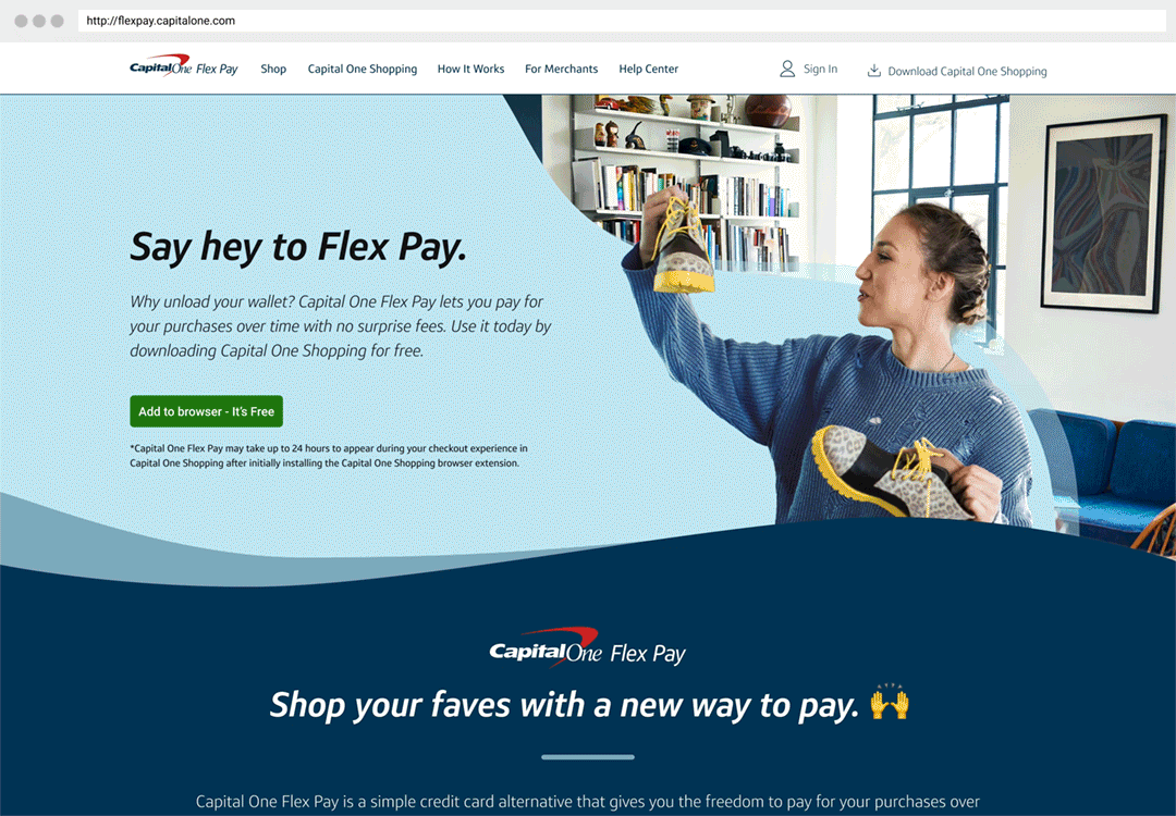
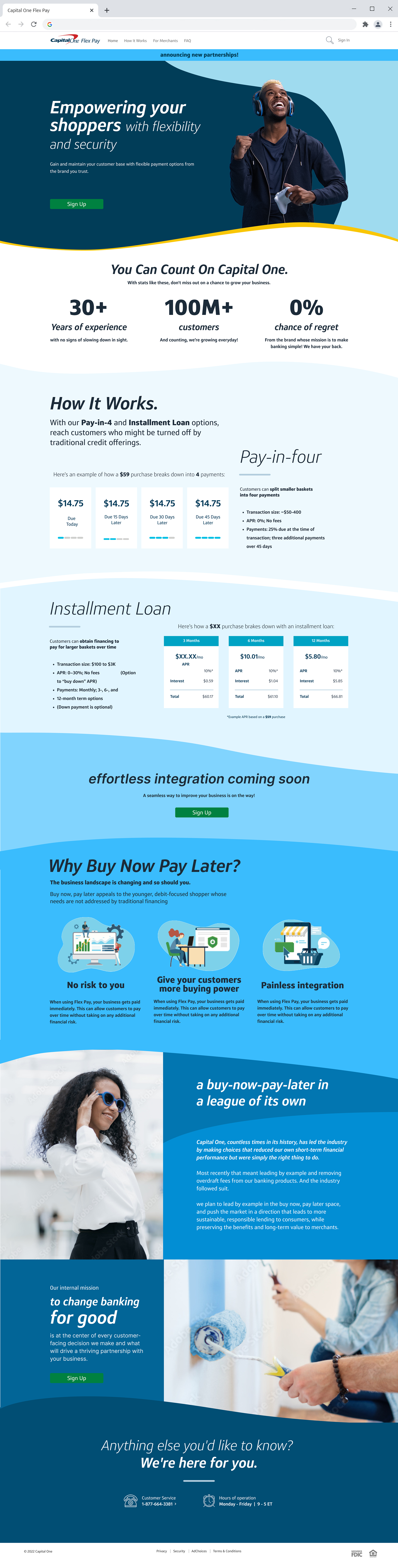
Landing Page:
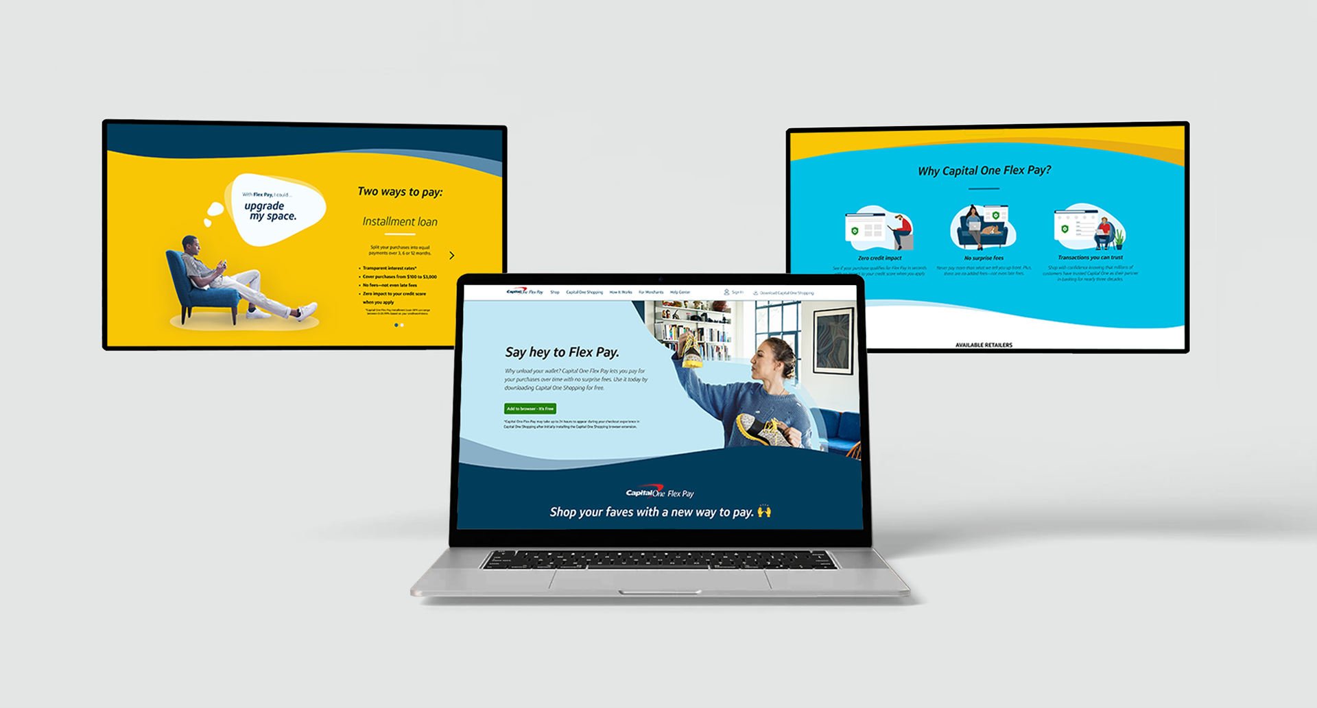
To create a cohesive feel for the site's multiple pages a consistent layout was developed for the top of each tab. The two-column design featured the text information on the left, balanced by a connecting swoosh graphic and a floating photo design on the right. In addition to establishing this page design pattern, the landing page included an introduction video about Flex Pay, an explanation of why Capital One created the product, and a short list of shopping options.
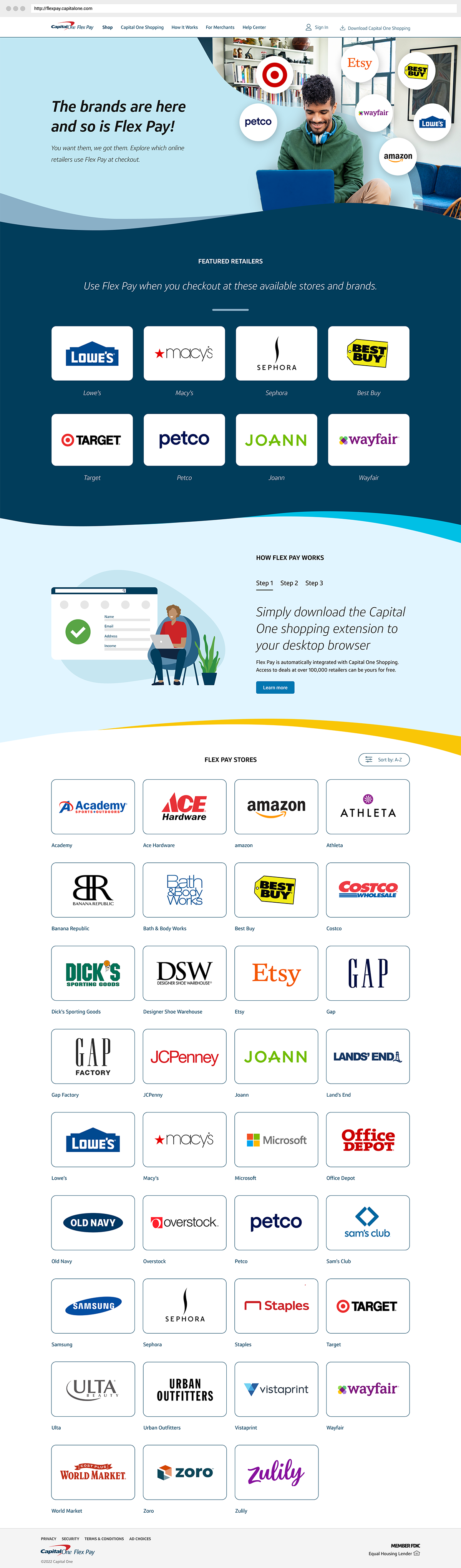
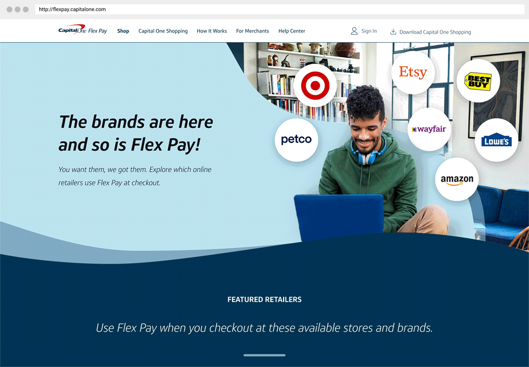
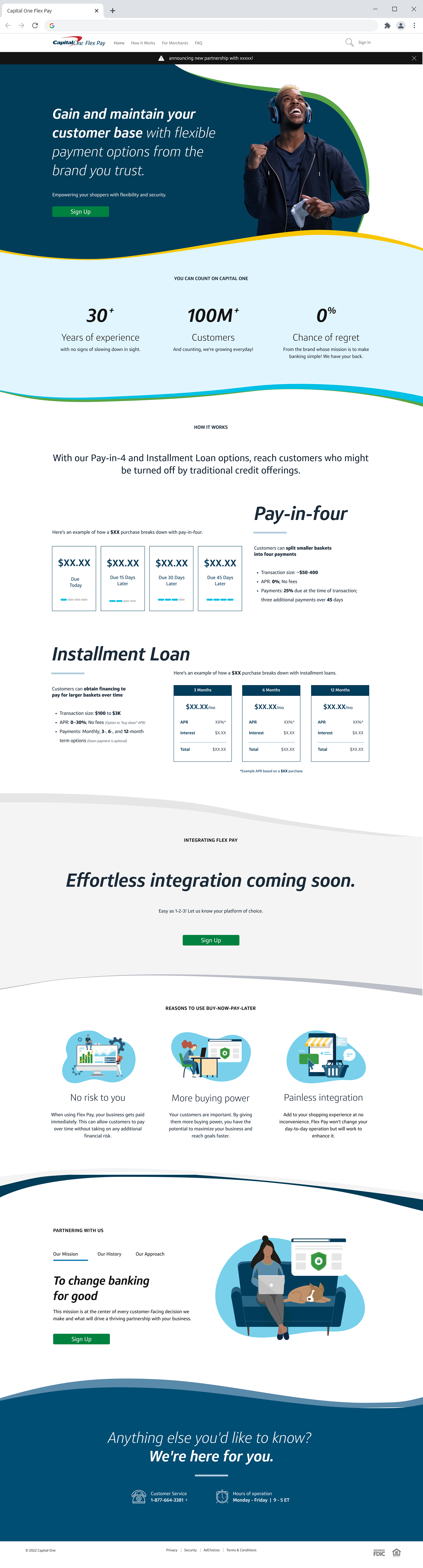
Shop:
A disadvantage for Flex Pay as a product, and a challenge for its users, is that Flex Pay is only available at certain retailers. To help users discover stores signed up with Flex Pay we provided a "Shop" tab. In addition to a quick use guide, the page includes a growing list of links to shop online with participating brands.
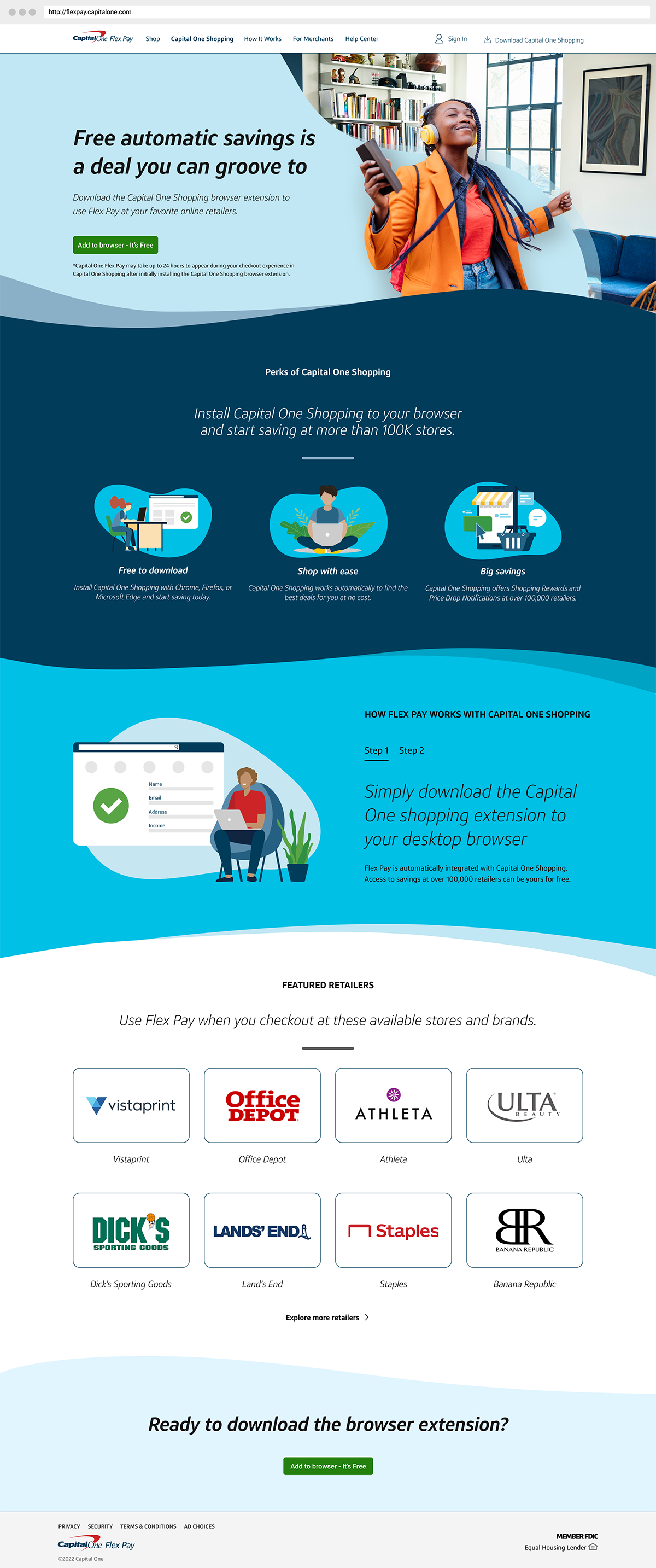
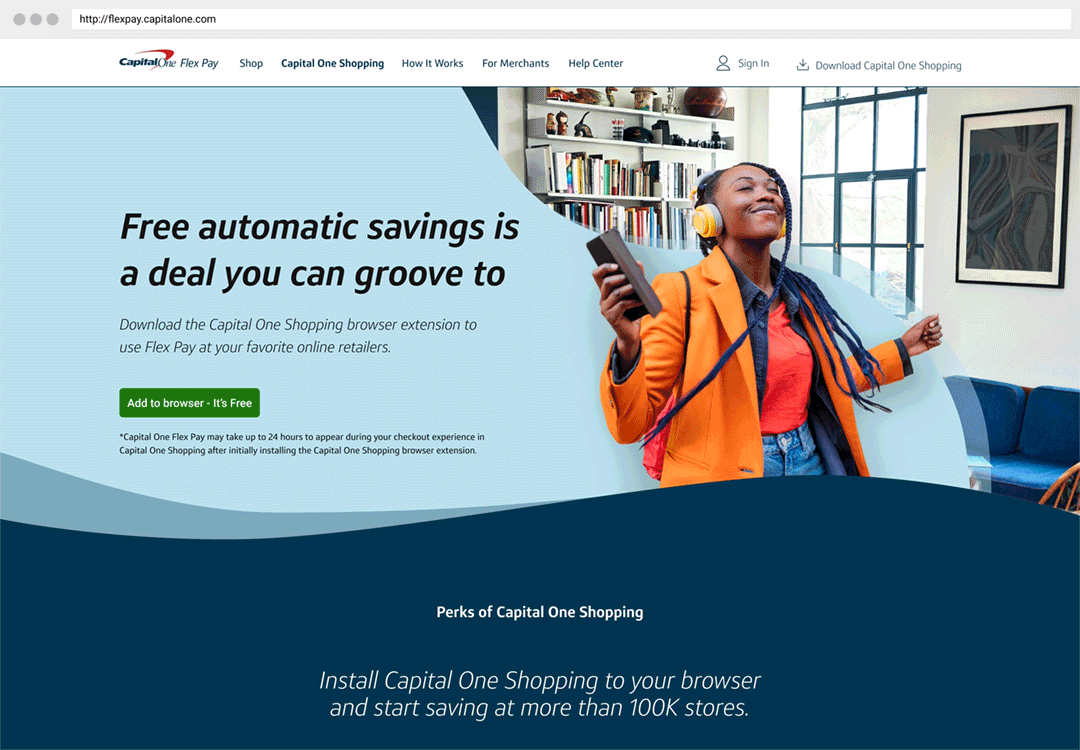
Capital One Shopping Extension:
Another Capital One product, the Capital One Browser Extension, helps users find and apply coupons while shopping online. Though Flex Pay may one day be available to use independently, in its beginning stages the only way to access Flex Pay is as a part of the Capital One Shopping Extension. To help users understand the extension and how to download it on their browser we created a dedicated tab.
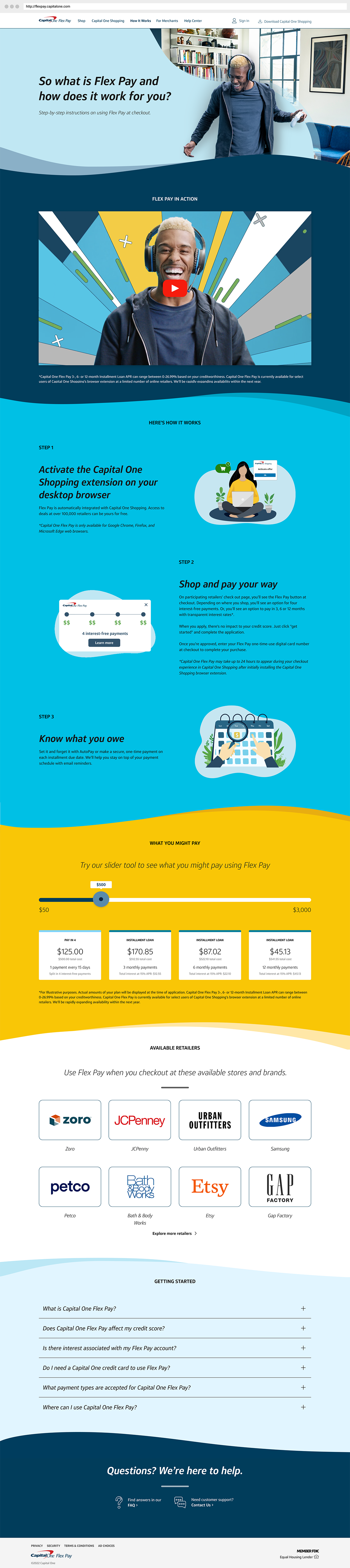
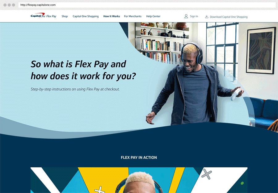
How It Works Page:
As Flex Pay was a new product it was important to create a page dedicated to further breaking down the process of how it worked for customers. The process was simplified into 3 steps, activating the browser extension, shopping at Flex Pay retailers, and understanding how to set up auto pay. The bottom of the page also included a tool allowing users to visualize how different payment plans look when applied to certain purchase costs.
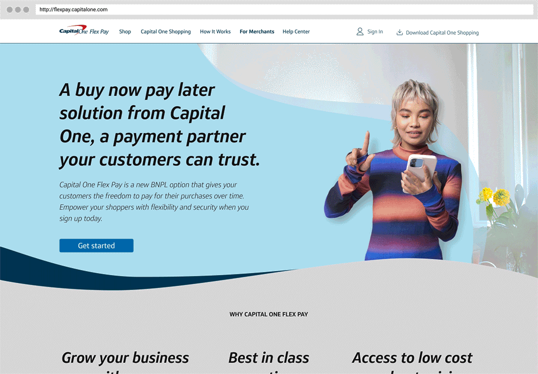
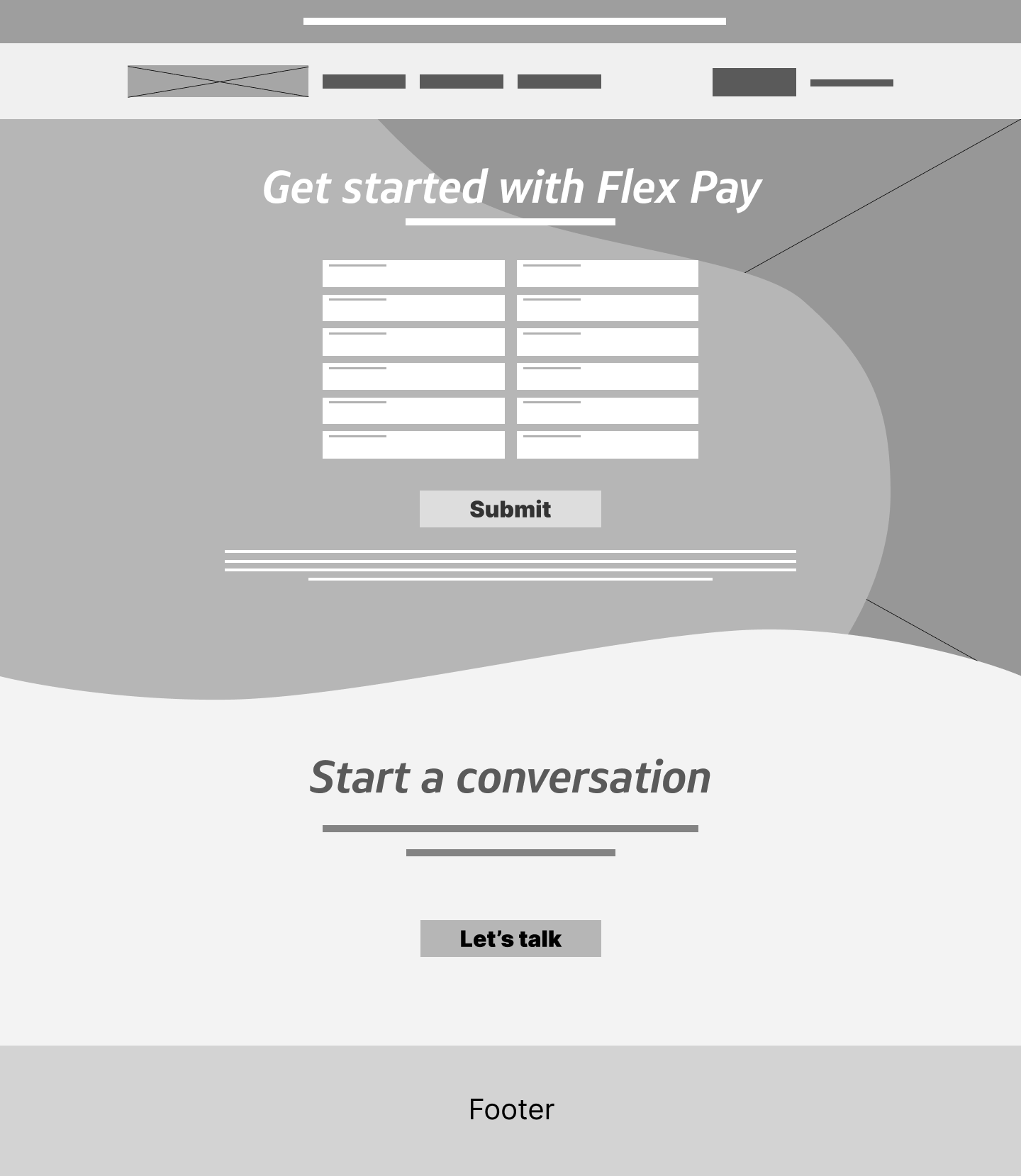
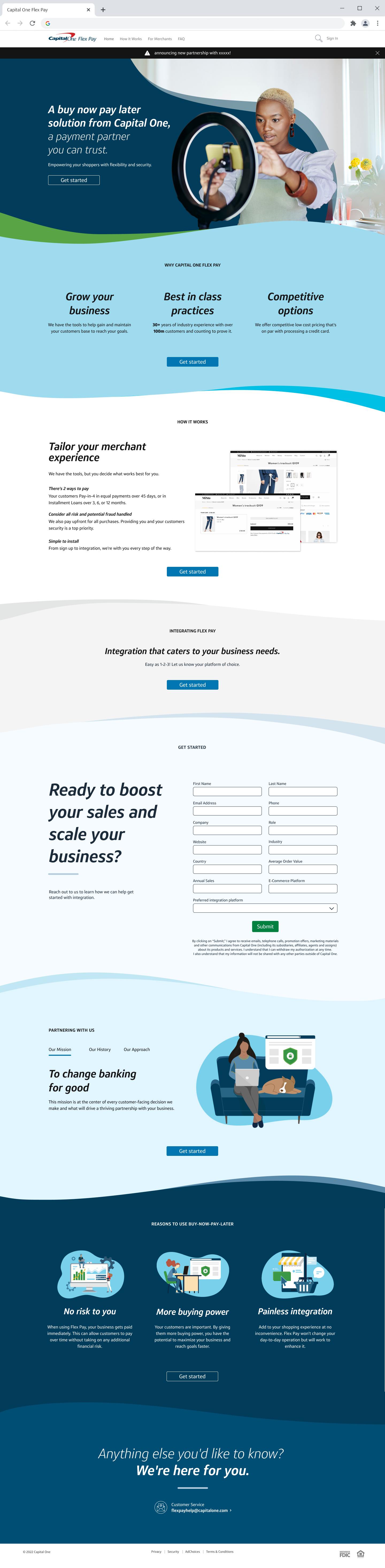
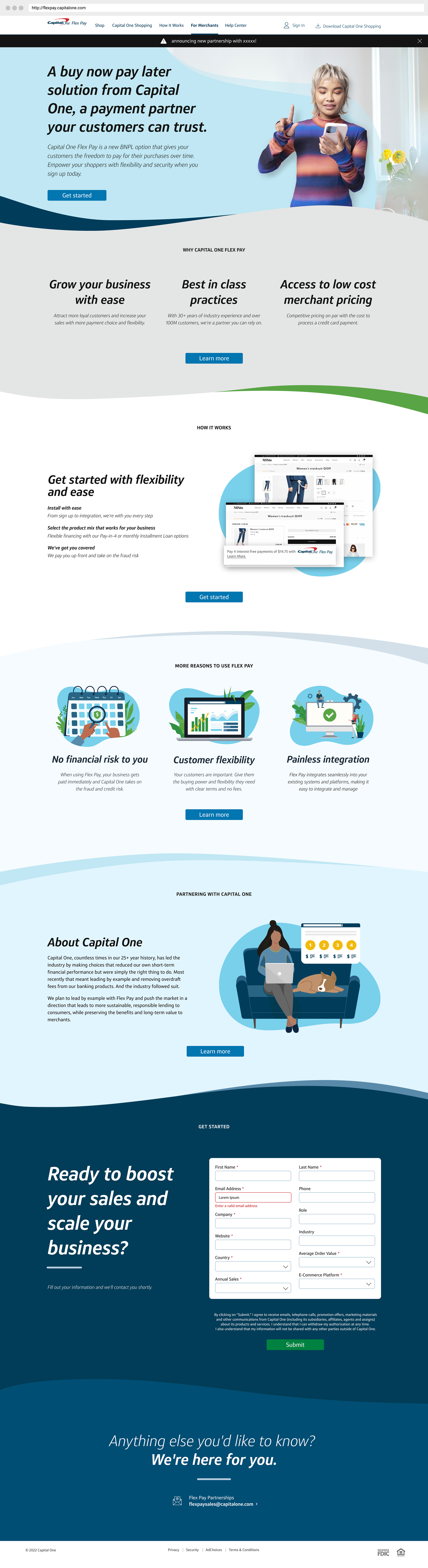
Merchant Sign Up Page:
Businesses interested in providing Flex Pay as a payment option were provided a specific MX tab for learning more about the details of integration. The page included a sign-up form, which was accessible by a CTA in each section directing to the bottom. We also created a modified version of the brand for merchants that felt a bit less playful and more professionally oriented.
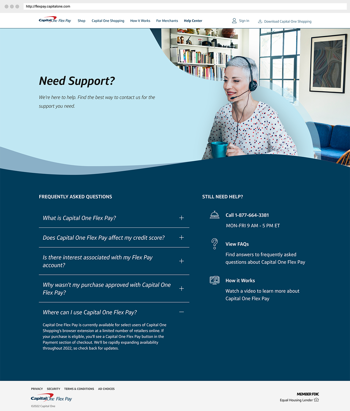
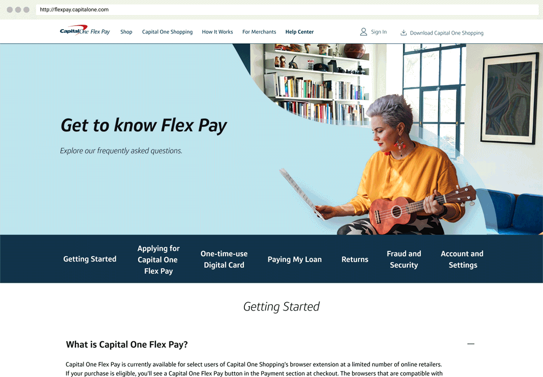
Help Page:
A wide variety of resources were provided to users in need of assistance with Flex Pay. We created a help center tab for the website that included FAQs, "Learn and Grow" materials, and contact information. The page design was simple and service-oriented but still successfully kept up with the stylish tone of the rest of the site.
Design Process
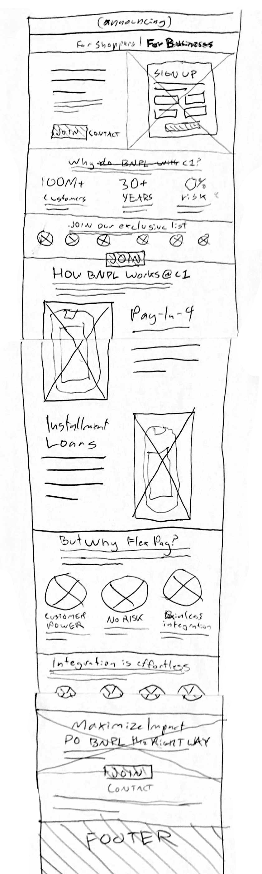
Sketches:
At the beginning of my design process, I made sketches of existing buy-now-pay later sites, Capital One Shopping's site, as well as early ideas for Flex Pay's website. The combination helped me as a designer to break down assumptions/biases and hone in on important existing design patterns familiar to the user audience.
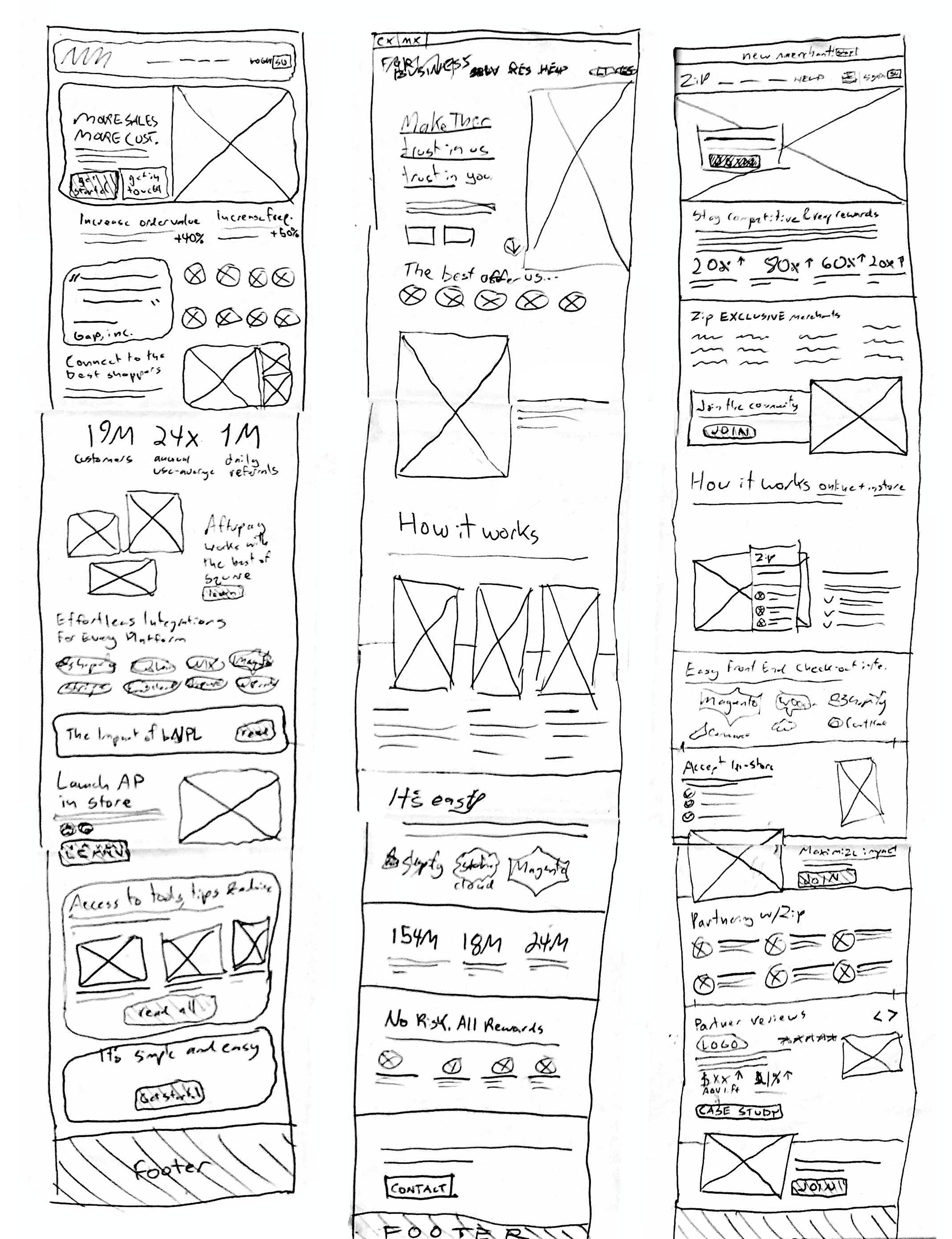
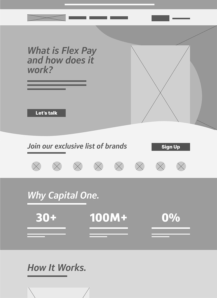
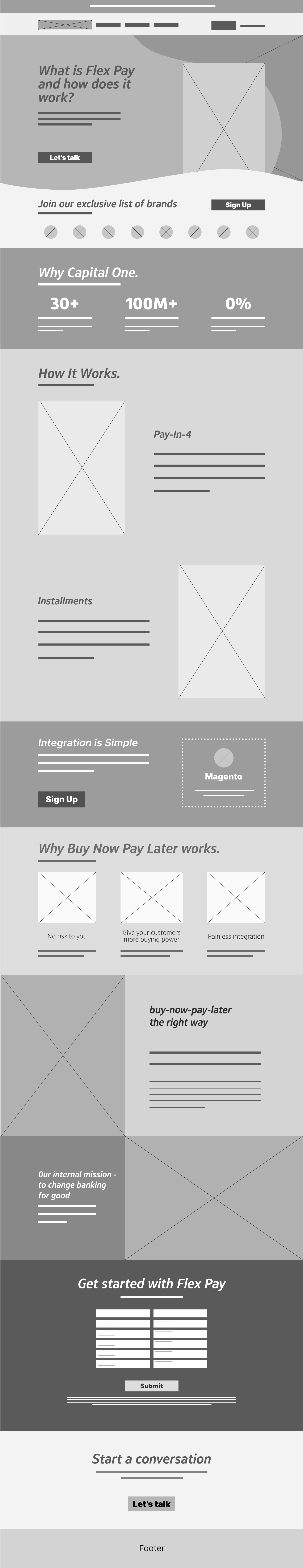
Wireframes:
After working through the rough ideation sketches I digitally polished some more clear ideas for the Flex Pay website. This phase included experimentation with content hierarchy and layout, as well as important brand elements such as the signature curves. Establishing design patterns like these early on helped save a great deal of time later on in the process.
Prototype Testing & Iterations:
Many improvements were made to the Flex Pay website thanks to feedback from users. For example, to reach the merchant form a consistent layout for CTAs was established with them centered and recurring in page sections. The content order fluctuated, bringing clear reasons to believe in the product to the top, and concluding information such as the form to the bottom.
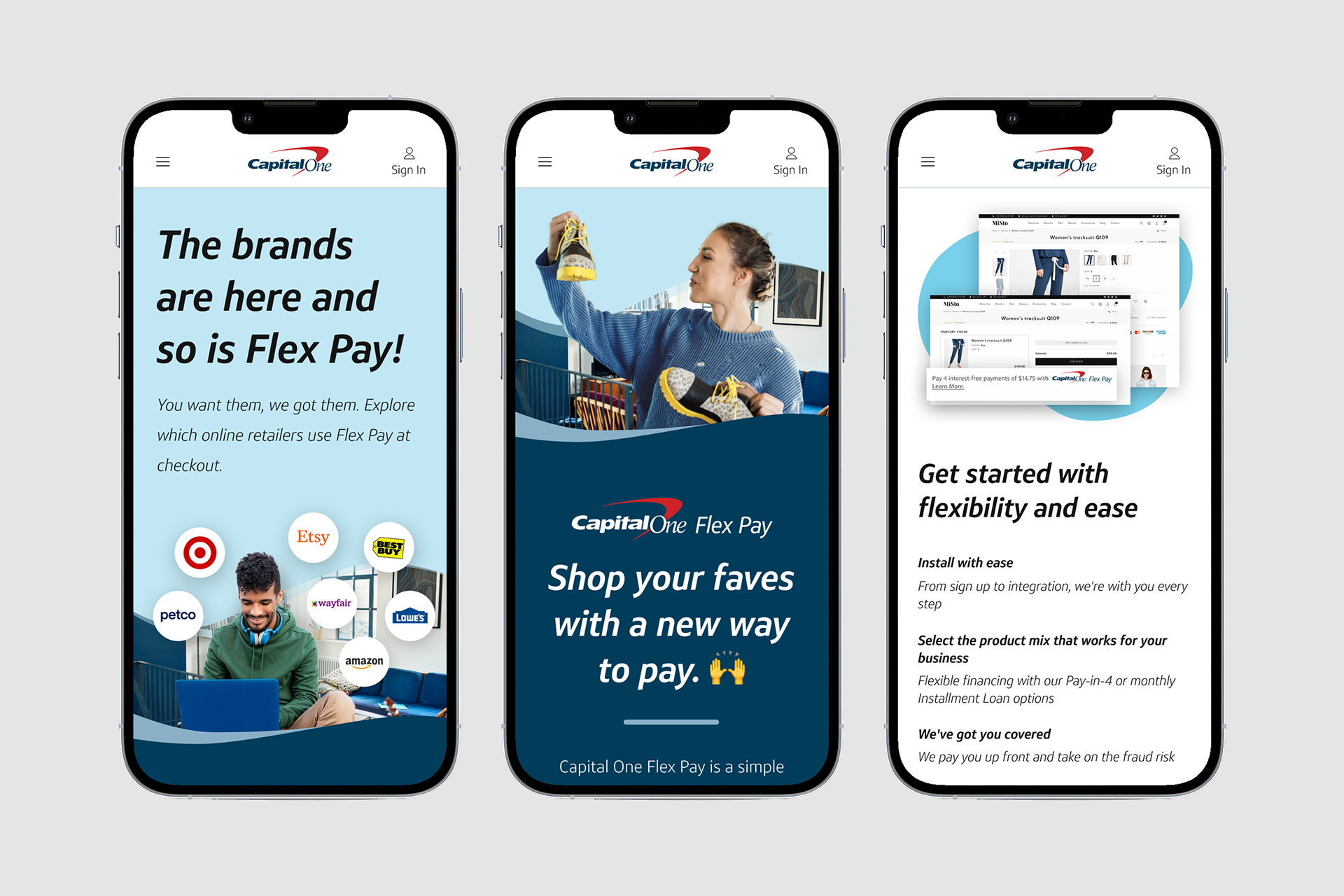
Mobile Designs:
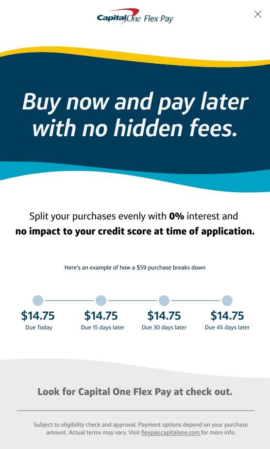
Vertical mobile versions of the designs were also created as a guide for the eventual responsive application. While most of the transition to mobile simply involved changing from a fewer-column grid, the header image presented a more dramatic challenge. Each page has a second version of the header image which loads on mobile devices. These mobile versions were built to accommodate header text above, as opposed to next to the image.


More Flex Pay Brand Work
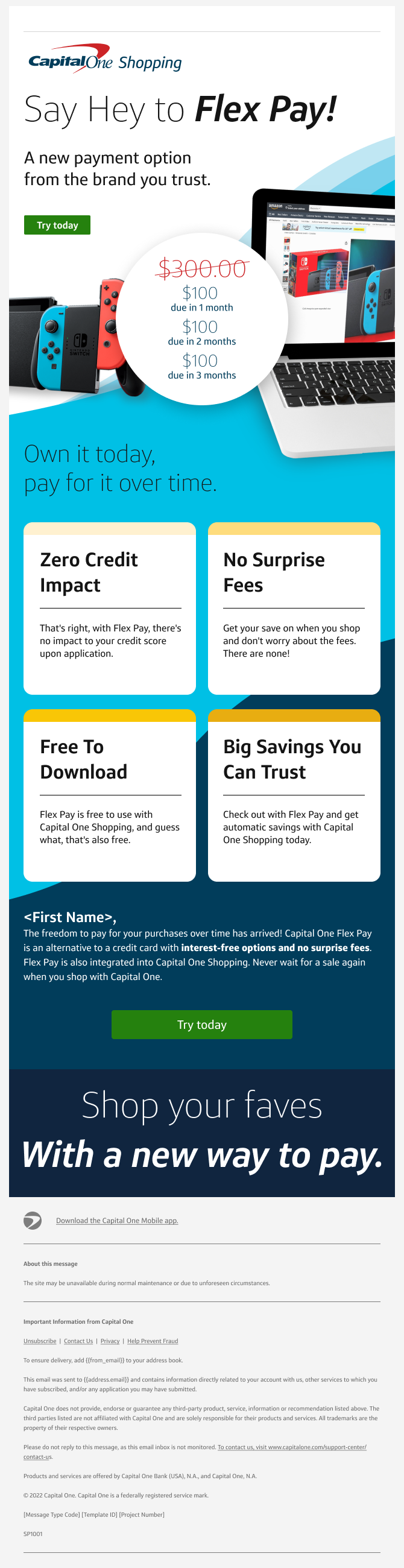
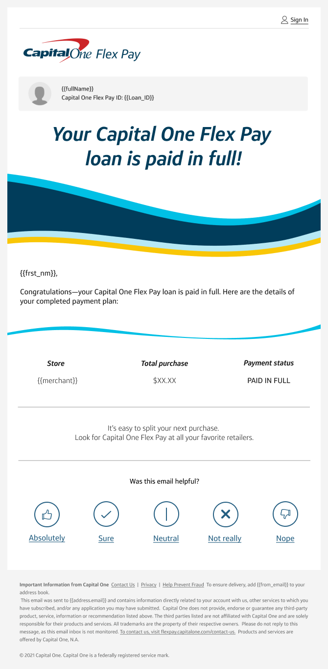
Emails:
In addition to the website Flex Pay's art direction included the production of both marketing and servicing emails. While servicing email design isn't typically something people get excited about, I enjoyed finding a creative way of visually identifying emails from different servicing categories. The subtly different waves were intended to efficiently brand the minimalist emails in a way that was also compatible with dark mode.

Ads:
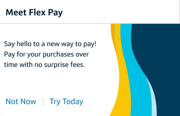
Flex Pay was advertised to users of Capital One's main application via offer tiles, zingers, and other pop-up modal windows.